Methodology

Electricity Maps' mission is to organize the world's electricity data to drive the transition towards a truly decarbonized electricity system. We provide carbon intensity data coming from electricity consumption for more than 200 zones in the world.
To do that, we follow state-of-the-art approaches to collect data from official sources. When data is missing, we use a variety of techniques to estimate it. We then run our flow-tracing pipeline to determine how electricity (and its carbon intensity) flows between countries. This allows us to provide carbon intensity information for both production and consumption for each country. Our methodology follows these steps:
In order to add a new data source to our dataset, we must ensure that the data source is official and reliable. Once the data source is verified, the data itself must be validated. All data must meet a set of requirements before we incorporate it into our production systems. These requirements are described in detail below.
Before adding a new data source, we need to make sure that we are using the best and most reliable data possible. In order to achieve this goal, we need to verify that the data originates from a source that is trustworthy and of high-quality.
Our data-collection processes (called parsers) are open source and anyone is welcome to contribute to them. Our contributors must follow the guidelines regarding data credibility and quality described here. We review all contributions thoroughly before we deploy them to our production systems.
Credible data can be published by the following organizations:
You can also find our existing data sources documented on our GitHub page.
We evaluate source quality using these criteria:
Once the technical requirements have been validated by Electricity Maps for a specific country and data source, the parser is implemented so that electricity data can be collected and ingested in our pipelines.
Currently Electricity Maps includes data on the electricity that flows on the power grid. Therefore our production and consumption figures do not include off-grid, stand-alone production or consumption (self-consumption). For the most part this means that production and consumption data related to small-scale rooftop solar (sometimes referred to as behind-the-meter solar) is not available on Electricity Maps. We are open to including this type of data on our app. However, thus far we have not been able to find reputable, reliable data sources that meet the requirements described above.
Parsers are scripts that automatically fetch data from different sources and format it in a uniform way. The formatted data is then saved to our database and processed using the flow-tracing algorithm.
Our parsers are open-source. Many of the parsers are contributions from our community. These parsers are validated and deployed after a thorough internal review. This review includes verifying the source and ensuring that we comply with the source’s terms and conditions. We also verify that each parser meets our technical requirements before adding its data to our app. We do not deploy parsers unless they have been reviewed, validated and approved internally.
The data collected by our parsers include:
For more detailed information, please consult our GitHub wiki, where you can find our complete methodology and data sources.
Both our app and our API provide information on the carbon intensity of a given zone’s electricity. Highly granular carbon intensity data is essential for most use cases, such as load-shifting and 24/7 carbon-free energy reporting. This page describes the process we use to calculate carbon intensity figures.
Carbon intensity measures how clean the electricity consumption is in a zone at a given time. It represents how many grams of carbon dioxide (CO2) are released in the atmosphere for each kilowatt hour (kWh) of electricity consumed.
In other words, carbon intensity represents the greenhouse gas footprint of 1 kWh consumed inside that zone. This footprint is measured in gCO2-eq (grams of CO2 equivalent), meaning that each type of greenhouse gas can be converted to its CO2 equivalent in terms of global warming potential over 100 year (for instance, 1 gram of methane emitted has the same global warming impact during 100 years as ~34 grams of CO2 over the same period). The carbon intensity of electricity generation of a zone is determined by the power production mix and their associated carbon intensity factors. There are two types of emission factors displayed on the map: default factors and regional factors.
The carbon-intensity factors displayed on the map are emission factors computed based on the whole lifecycle of employed fuels and generation technologies. These numbers come mostly from the IPCC (2014) Fifth Assessment Report, which aggregates emission factors estimated by a multitude of peer-reviewed studies. The IPCC 2014 report is regarded as the global standard for measuring the global warming potential of different electricity sources. Emissions resulting from the extraction of resources required to build up installed capacity, emissions from direct operations, and end-of-life related emissions are all accounted for. The overview of the steps covered throughout the lifecycle is pictured in Figure 1.
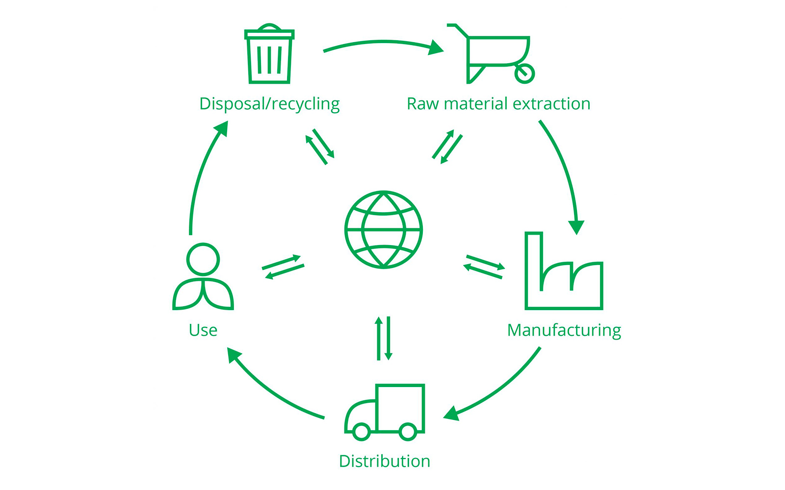
For each type of power plant, lifecycle emission factors account for fuel extraction and processing, construction and dismantlement of the plant, operations and anything in between.
To compute the CO2 emissions of the electricity consumption for a specific zone, we need to calculate how the electricity has been produced in that specific zone or country. This calculation also accounts for the electricity exchanged between countries, and how the electricity has been produced in that neighboring country. This is defined as tracing back the origin of the electricity, or flow-tracing. If you want to know more about the flow-tracing algorithm, please refer to the following article, or to the "Carbon collection and processing" tab of the methodology.
Once the origin of electricity is identified and broken down by power plant type, we can use the predefined emission factors, see below, and assess the carbon intensity of a specific zone, resulting in the values we can see in the map (Figure 3.)

The carbon-intensity factors displayed on the map are emission factors for the whole lifecycle of consumed fuels and used power plants. As explained above, these numbers come mostly from the IPCC (2014) Fifth Assessment Report, which aggregates emission factors estimated by a multitude of peer-reviewed studies.
Sometimes TSOs or energy organizations publish emissions data linked to electricity emissions. In most cases, the values published are computed using operational emission factors. These emission factors only account for emissions that directly result from the operation of a given electricity source. For example, the combustion of gas in gas power plants directly releases greenhouse gasses in the atmosphere, while the photovoltaic effect that powers solar cells does not.
These values are very different from those displayed on the Electricity Maps app. On the app, we account for all emissions generated during the construction of power plants and during the extraction of these fuels. For some commercial purposes, we also support operational emission factors in our API.
The table below illustrates the emission factors used for the majority of zones displayed on the map.
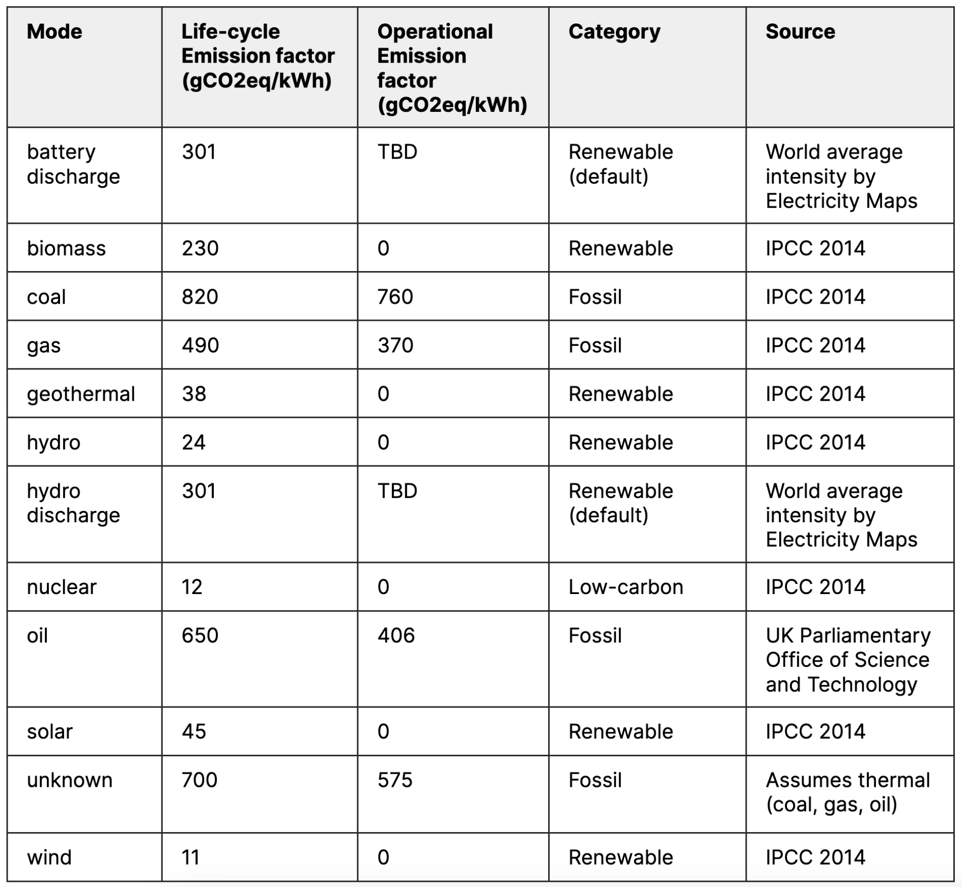
For some zones, specific emission factors are available. This is the case for the US and the EU where direct power plant emissions are publicly available. It is possible to match these emissions with power plant generation data and compute per power plant emission factors, which can be aggregated at a zone level.
There are also some reputable sources, such as peer-reviewed scientific papers, or meta-analysis that offer direct emission factors with a precise geographical granularity. Using regional emission factors enables us to increase the precision of our data and to better reflect the impact of a zone’s electricity sector.
Electricity Maps’ emission factors are all publicly available here.
Alongside carbon intensity we provide a low-carbon percentage and renewable percentage, these are calculate using the follow equations:
Low-carbon percentage:
Fossil fuel percentage:
Renewable percentage:
*By default unknown is assumed to be made up of fossil fuel based modes and is excluded from low-carbon percentage and included in fossil fuel percentage, if more accurate data is available this can be overridden by a zone specific percentage calculated from the yearly average for that zone. See example here: https://docs.google.com/spreadsheets/d/1FLHQ6e9Es08BIqX654BM3SEb_fuAk4k4O-6cmRXyw_E
**hydro and battery discharge are renewable by default but can be overridden with a specific percentage on a zone by zone basis. See example here
For more information, you can consult our GitHub wiki where you will find our complete methodology on emission factors and how we compute carbon intensity.
What happens when we have missing data? In some cases, our data parsers are not able to collect data for one or more dates. In this scenario, we estimate the missing data in order to ensure the continuity of the time series. In other instances, the source data is not complete or not granular enough. Here we use a specific model that estimates the production breakdown as accurately as possible.
At Electricity Maps we aim to provide granular information about the electricity generation continuously, meaning that data is complete 100% of the time. Ensuring that the data is completes means that it can be applied to different use cases.
However, the data coming from various sources (TSOs, energy utilities, government-affiliated sources, etc.) might be unavailable due to delays in data transfer, database capacity problems, and others, leading to what we call missing data.
We take different approaches to deal with missing data; we call these approaches estimation methods. Each estimation method serves a different purpose and is related to the nature of the missing data we encounter, such as an outage of real-time data for a few hours, data reported with insufficient precision, or the unavailability of real-time data.
The first type of gap occurs when we are missing data for a short period of time, ranging usually from hours to a week. To address these gaps we implement the Time Slicer Average (TSA) estimation method. This estimation method uses available data to fill in the gap. Each missing point in the gap is filled by the average of the available data points that belong to the same time period but on different days in the given month. The estimation is then aligned in order to ensure the continuity of the estimation points with the bounds of the gap observed.

In many zones and countries, real-time data is not always initially available and may be delayed by several hours. In these situations, we will employ a system of hierarchical estimation models based on external forecasts, internal forecasts, and Time Slicer Average (TSA). These models will complement each other to provide a more accurate estimate than any single model could achieve on its own.
Initially, we will use external estimates, then fall back to our internal estimates if the external ones are unavailable. If both are unavailable, we will fall back to TSA estimates.
As we implement this, the forecast data used will be limited to solar and wind energy. Estimates for other modes will rely solely on TSA-based estimates.
For some zones and countries, real-time data is not available. Typically, these are zones which have monthly or yearly aggregates delayed by periods of 1-12 months and up to more than a year. These zones also show very little variable integration, from wind, solar or hydro.
Here, we use the Construct Breakdown method. This method is based on estimating a total hourly production with a simple model, calibrated to match the available aggregated data. Total production is then broken down into a production mix using a static breakdown estimated from historical aggregates.

In some cases, data is available continuously in real-time, but it only represents the total production of that country or zone. Here, production is collected and labeled as unknown. In other cases, the production mode signal is not always available or reliable. For these examples, we apply the Reconstruct Breakdown estimation model.

First, we compute or estimate renewable energy sources. We do this by training an estimation model for renewable energy sources considering weather parameters such as wind speed, wind direction, and solar irradiation. These models are trained based on the historical data available.
Once these production values have been estimated, we estimate the rest of the production by applying a static breakdown over the remaining production (total - variable renewables). The breakdown is again computed by using the available historical data for each production source.
For some specific zones, we cannot implement any of the above methods. For example, we may have real-time data for a given zone that contains an erroneous breakdown for one or more of the production modes. This is the case of Switzerland (CH), where the data provided by the data source is fetched in real-time but categorizes small-scale hydropower plants under the "unknown" production mode instead of under "hydro", leading to inaccurate values for the share of electricity coming from renewable sources. In some other cases such as The Netherlands, the data provided by the live-parser data does not match official statistics.
In these cases, specific estimation methods are implemented for each particular zone, and they are detailed here.
Once the missing data points have been estimated, the time-series is considered complete and the following steps of flow-tracing, data storage and visualization can take place.
However, we always prefer real-time data to than estimation methods. In cases where data was missing due to delays and the data provider has since updated their datasets with new data, the estimated data points are replaced by the real measured data. Then, the flow-tracing pipeline is triggered again, updating the carbon intensity values for the affected hours.
Please check out our technical documentation, available in our GitHub repository here
Once the data is collected and stored in our database, the estimation pipeline and the flowtracing pipeline are run. The estimation pipeline ensures that our final dataset is complete. The flowtracing pipeline is used to compute the electricity consumption breakdown and the carbon intensity of a zone’s electricity consumption.
Our data is collected for more than 200 zones from verified data sources. The data collected needs to be aligned so that the final dataset is consistent across all zones. This process is done with the estimation pipeline and the flow-tracing pipeline. The flowtracing pipeline also outputs the zones’ average carbon intensities, which can be viewed on the app and accessed on the API. The full process is shown in the figure below (Figure 1).
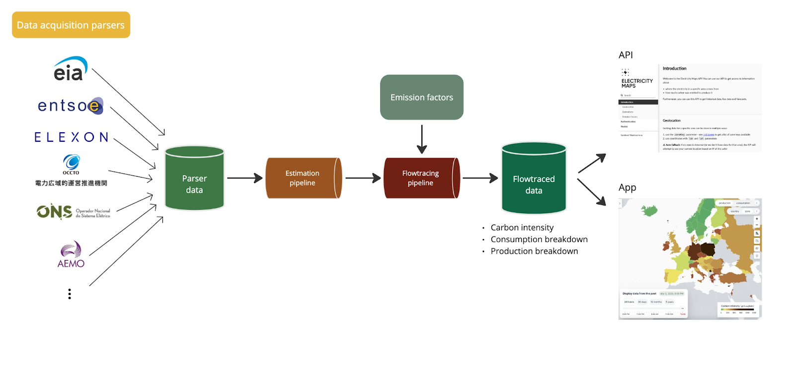
Data is first collected using data acquisition parsers. Then we store it in a relational databse in a parser data table before we process it. The data acquisition pipeline runs continuously to collect the most up-to-date data.
Some sources are delayed compared to others which can impact the final consumption mix. In some cases, data can be missing or needs to be estimated because of poor data quality. Before running the flow-tracing pipeline, all missing data points and specified zones are estimated using the estimation pipeline. This pipeline runs hourly for the last 3 days. Once the estimations are implemented, the flow-tracing pipeline runs for the last 3 days of data. This enables us to have the most accurate state of a grid at any given point in time, for electricity consumption and carbon intensity.
The final data is then stored in the flow-traced data table. This flow-traced data is represented on the app and on the API.
Electricity grids are networks which contain power lines and power plants spanning across multiple areas. A simplified representation consists in dividing up the electricity network in zones within which the electricity is assumed to flow freely without any restrictions. These zones can represent countries, states or even islands, depending on the data available.
Electricity can flow between these zones using interconnectors. They enable imports and exports of electricity between neighboring zones. The limited capacity of the interconnector imposes restrictions on how much electricity can flow to and from a neighboring zone.
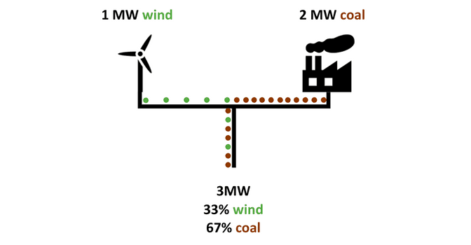
The electricity available on a given grid is determined by the share of power supplied by each power plant connected to that grid. In the example shown below (Figure 2), if a coal power plant produces twice the power of a wind turbine, then the final mix is twice as coal-intensive as it is wind-intensive. It is important to note that in this situation, a consumer cannot choose to consume electricity generated exclusively from wind. They can only consume electricity with proportions given by the share of sources.
These characteristics have the following main consequences:
The flow-tracing methodology is used to trace back the mix of electricity available in a given area, even in the presence of loop-flows. The methodology is a concept introduced in this peer-reviewed paper, applied on the European electricity grid in this paper, and on the US grid in this paper.
The resulting mixes in each zone depict where the electricity available in a given zone originates. Furthermore, flow-tracing shows the propagation of electricity locally generated (see figure below).

In the figure, the width of the arrows is proportional to the amount of electricity transmitted. The cascade of electricity flows from German wind and Polish coal are highlighted with blue and brown arrows, respectively. The cascade stops when the share of German wind or Polish coal becomes too small to be drawn. This happens in France for instance, as the local generation is very large compared to the imported German wind, which causes the exported electricity to contain almost no German wind.
Once the origin of electricity is identified and broken down by power plant type the carbon impact of a zone’s electricity production and consumption is computed using emission factors computed through life-cycle analysis.
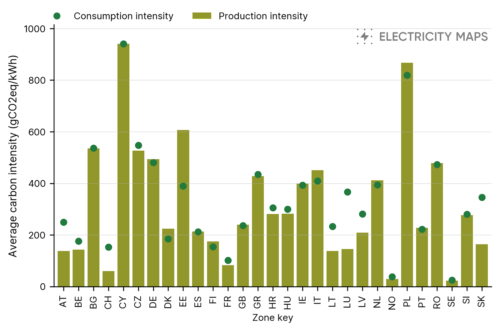
Figure 4 shows the importance of taking into account the full chain of imports. The carbon intensity of the consumption mix (computed using the flow-tracing algorithm) is influenced by the electricity exchanges and can be much higher or lower than the carbon intensity of the electricity generated in the zone. For example, in Austria electricity is mainly generated from low-carbon sources and the average carbon intensity of electricity production is quite low compared to the European average. The carbon intensity of the electricity consumption mix is significantly higher because of the imports from neighboring zones such as Germany and the Czech Republic which have a more carbon intensive production mix.
Check out the following blog posts about the flow-tracing methodology, how our flow-tracing pipeline runs, and about production vs consumption carbon intensity.
Explore our API with a free trial or talk to our team to get answers to your questions.