Car makers with most distracting touchscreens revealed as drivers and safety bodies say they want more buttons in vehicles
- Nine in 10 UK motorists want car makers to provide more physical buttons
- Some 60% admit to taking their eyes off the road for periods to change settings
- What Car? test reveals which brand's current touchscreen is most distracting
Nine in ten drivers have urged car makers to ditch the latest wave of overly confusing and distracting touchscreen systems in new motors, calling for them to take a step back in time by bringing back buttons and switches on dashboards.
It comes as three in five polled said they have been distracted by an infotainment display while trying to drive.
There have been growing concerns that the recent shift to larger screens with masses of sub menus and complicated controls are not intuitive for motorists to operate on the move, therefore becoming an increasing safety risk.
And a new test by a leading motoring consumer title has tested and revealed which brands have the best and - more importantly - worst touchscreen setups that are difficult to navigate for drivers.
* Scroll down to see how the brand of car you own rates for how distracting its infotainment systems are to use.
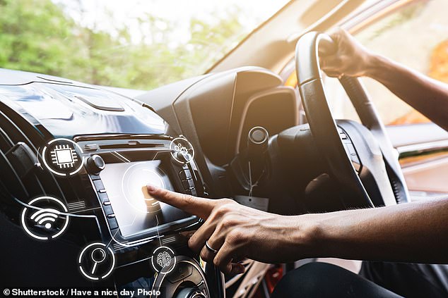
Are you being distracted by your car's touchscreen? Almost 9 in 10 drivers say they want manufacturers to revert back to physical button controls that are easier to operate on the move
The new report by What Car? has found that the vast majority of Britain's drivers want to be less reliant on these touchscreens, preferring cabins with more switches.
In a survey of 1,428 drivers, it found that 89 per cent prefer having physical buttons, knobs and dials in their cars over touchscreen systems that can be fidgety, time-consuming and sometimes infuriating to operate - especially when on the move and trying to concentrate on the road ahead.
The poll found that manufacturer's fixation with fitting their latest models with complicated iPad-style gadgets is becoming a major turn-off for car buyers.
Three in five (60 per cent) said they would be put off purchasing a model that didn't have traditional buttons and switches on the dashboard and relied heavily on touchscreen controls.
In contrast, just 8 per cent said they would be more attracted to a motor with a completely uncluttered cockpit with almost all the functions adjustable via a flashy touchscreen system.
Worryingly, 60 per cent of the UK motorists surveyed said they have been distracted from safe driving while operating in-car controls - although What Car? points out that these distractions are not limited solely to touchscreen interfaces, which are used by more than one-in-seven drivers.
When respondents were asked why they preferred using buttons to touchscreens, safety and not having to take their eyes off the road were cited as the main reasons.
Participants in the study said using touchscreens took longer, while some found it difficult to press the right icons while driving.
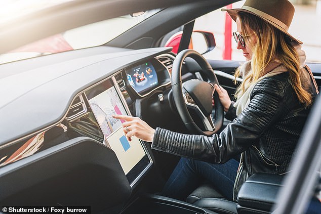
Some 60% of the UK motorists surveyed said they have been distracted from safe driving while operating in-car controls. This is especially the case with touchscreens
Which brands have the most distracting touchscreens?
To see which car makers have the best and worst cockpits in terms of distraction level, What Car? tested existing infotainment systems from 21 different brands.
Tests were carried out under controlled conditions on a test track and used advanced eye tracking technology from Tobii to measure how long a driver's eyes were off the road while performing three common tasks: changing a radio station; setting a sat-nav destination; and adjusting the interior temperature.
And it found that, generally, those with touchscreen-led interfaces and limited voice control systems were far more distracting and time-consuming to use while driving - while those with physical controls or high-quality voice control systems were much simpler to operate while being able to concentrate on the road ahead.
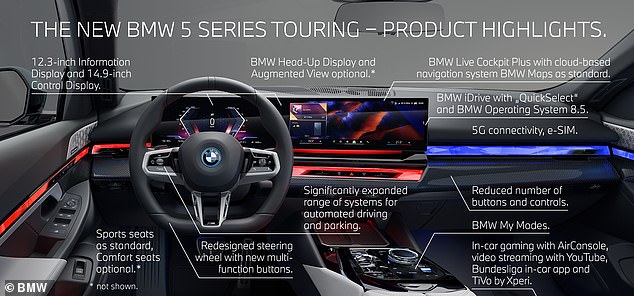
The new iDrive8 system fitted to the latest BMW 5 Series received the highest score in What Car?s recent test. It was applauded for its easy to operate rotary dial controller and responsive voice controls
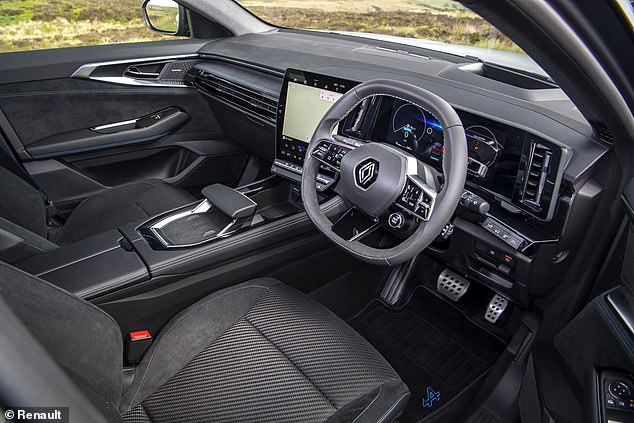
Renault's OpenR system scored the second highest rating, with What Car's test finding it was nowhere near as distracting to operate as setups from rivals
The iDrive 8 system in the latest BMW 5 Series achieved the highest overall score of 87 per cent in the test.
Its top score came thanks to its responsive voice control system and intuitive rotary dial controller, which means drivers can make changes to the car's infotainment settings without having to look away from the road, resulting in minimal driver distraction.
Renault's OpenR system - tested in the new Austral SUV - was close behind with an overall score of 83 per cent, followed by the Volvo's Google-based system, examined in an XC60.
In contrast, the Interlink infotainment system in the Vauxhall Corsa finished bottom in the rankings, with a score of just 22 per cent.
It scored slightly lower than Suzuki's touchscreen setup, with the one in its S-Cross rated at just 24 per cent.
Both were downgraded by What Car? for providing limited functionality, and neither had voice control systems that understand natural speech; instead, they require the driver to remember specific commands.
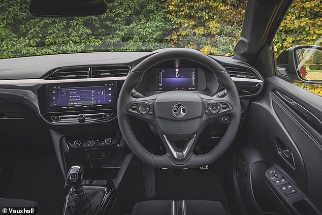
The Vauxhall Interlink system - tested in the Corsa supermini - scored a meagre 22% rating in What Car?'s test, which measured how long a driver needs to look away from the road to make simple adjustments to the radio, sat-nav and temperature controls
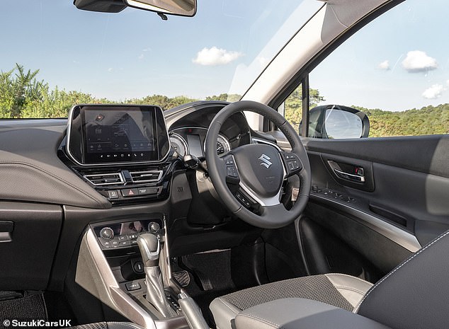
The Pioneer SLDA infotainment system in the Suzuki S-Cross also scored poorly. What Car? said its voice activation system required specific commands, making it less intuitive to use
The motoring title's consumer editor Claire Evans said the study highlights that car makers need to consider plenty of control options - including buttons and voice command systems - to provide easy-to-use, less distracting infotainment and air-con systems.
'The very best systems, such as BMW's iDrive, Renault's OpenR and Volvo's Google Built-in, give drivers a number of ways of accessing frequently used functions.
'In contrast, the touchscreen operation of infotainment systems is especially distracting if they are slow to respond or hide frequently used functions in submenus that are fiddly and time-consuming to navigate,' she said.
Car makers will be penalised if they don't provide button controls for simple tasks
The research comes in the wake of independent car safety body, Euro NCAP, announcing plans to downgrade the safety ratings of cars that don't have physical buttons for controlling five key functions.
From 1 January 2026, vehicles without physical hard buttons or switches for the indicators, hazard lights, horn, windscreen wipers and SOS function will also receive lower marks in crash tests.
The growing trend for removing buttons and adding more control functionality to touchscreens is said to be 'undermining' the ban on using a phone at the wheel, which since March 2022 will land motorists who touch their device with six penalty points on your licence and a £200 fine (and if, within two years of passing your test, will cost you your licence) if caught by the police or roadside cameras.
For years, road safety experts have been warning that the latest cars are proving an increasingly distracting danger.
Designers love the use of larger, high-definition screens because it clears the dashboard of - as they see it - unnecessary 'clutter' to create a clean, minimalist feel.
Industry bean-counters also prefer this setup because it cuts costs by removing switches and wiring in favour of an iPad-style dashboard run by downloadable software.
The electric Tesla Model 3, for instance, doesn't have a traditional instrument cluster behind the steering wheel to tell drivers their speed, remaining battery range and satellite navigation turn instructions. Neither does it have a head-up display that beams this information onto the windscreen so a driver can take-in the info without glancing away from the road.
Instead, owners must instead turn their head to look at the 15.4-inch landscape display in the middle of the cabin.
This pales in comparison to Mercedes' biggest screen - called the Hyperscreen - which is 55.5 inches wide and spans the entire dashboard of its high-end electric models.

The Tesla Model 3 doesn't have an instrument cluster behind the steering wheel. It means the driver needs to peer over to the large tablet-style screen to see the speed they're travelling

Car makers are in an arms race to develop the most technologically-advanced infotainment screens. Pictured is the Mercedes-Benz MBUX 'Hyperscreen'

The Hyperscreen is wider than most living room televisions. At 55.5-inches - over 141cm wide - the curved units spans the width of the dashboard.
Volkswagen, which has come under criticism as late for its below-par infotainment systems - including slider controls for the temperature and volume settings below the touchscreen that are not backlit, meaning they are incredibly difficult to locate at night - also continues to shift simple controls into its elaborate touchscreen systems.
The new ID.7 electric saloon does away with conventional vents to blow hot and cold air towards passengers and instead the driver has to tap the screen to adjust the intensity and direction the flow of air is distributed.
Even Volvo, a brand that's been a byword for vehicle safety for decades, is at it.
Its new EX30 EV requires the driver to press through a sub-menu on the car's touchscreen just to adjust the electric mirrors and the rear window de-mister. Though it's worth pointing out that What Car? found the Volvo system even to use when making changes to the radio, sat-nav and temperature settings in its controlled test.

Volkswagen's electric ID.7 doesn't have conventional air vents. Instead, how the air is distributed around the cabin is controlled by an elaborate setting in the touchscreen

Even Volvo, a brand that's been a byword for vehicle safety for decades, has been accused of shifting too many controls to its touchscreens. The new EX30 EV requires the driver to press through a sub-menu to adjust the electric mirrors and the rear window de-mister
And not all car makers are going in this direction.
Mazda has opted to keep traditional controls in its new models.
And it's the Japanese brand that is likely to score best in Euro NCAP's new safety tests in 2026.
Matthew Avery, director of strategic development at Euro NCAP, told The Times earlier this month: 'The overuse of touchscreens is an industry-wide problem, with almost every vehicle-maker moving key controls onto central touchscreens, obliging drivers to take their eyes off the road and raising the risk of distraction crashes.
'New Euro NCAP tests due in 2026 will encourage manufacturers to use separate, physical controls for basic functions in an intuitive manner, limiting eyes-off-road time and therefore promoting safer driving.'
Distraction an increasing cause of road deaths
Concerns about the wider use of touchscreens come in the wake of a 10 per cent spike road deaths in Britain.
In 2022, some 1,711 people lost their lives due to crashes on our roads, up from 1,558 fatalities the year before, the Department for Transport confirmed in its latest update. It said that the rise was down to the return of normal traffic levels after the Covid pandemic.
Experts said the rise partly been driven by crashes caused by drivers speeding or being impaired or distracted - all of which reached their highest levels seen in almost a decade in a 'chilling' reminder that more can be done to curb Britain's road casualty numbers.
So worried are leading motoring experts that the issue was raised as a matter of concern by trustees of the AA Charitable Trust for Road Safety.
AA President Edmund King told This is Money: 'There's nothing wrong with having a touchscreen. But is should not be for instructions which are essential to the driver - such as setting or adjust the mirrors or activating the windscreen wipers.
'Such controls need to be intuitive and not distracting. You should not have to go into a screen menu to find them.'
He added: 'A driver can adjust controls on a knob or dial with their fingertips without taking their eyes of the road ahead. It's intuitive.
'That is not the case with a touchscreen. This is something we will be looking at further.'


