A smartwatch concept using stripe-based interaction
The smartwatch is a reality. However, most of the smartwatches available are based on the same display-centered paradigm: attaching a small touchscreen to your wrist. While this approach brings some benefits, it seems to move us one more step towards the world of perpetual distraction.
The wrist watch is an orientation device. It allows humans to determine in which point of time we are. We look repeatedly to our watches to reorient ourselves in time and combine it with other data points from our daily activities: “What time is it? Ok, it’s 10:30, still 30 minutes before the meeting on the 6th floor.”
I was interested in ways to augment existing watches with the minimum digital information. Connecting our regular watch with the digital world just enough to improve our experience, but still keeping us in control of our time (which seems appropriate when we think about a watch). That is how Cronopio, my smartwatch concept, was born.
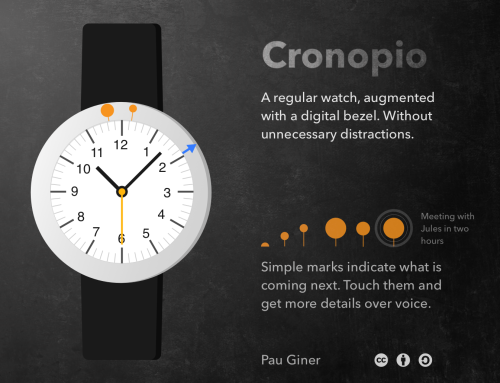
Cronopio: a smart watch concept with time in the center
Instead of making a display full of notifications as the central element, a regular watch is at the core of the concept. The interaction happens around it, at the bezel of the watch. A digital border augments the regular watch with small markers. These markers can communicate upcoming events like a meeting or indicate the directions to get where the meeting will be held.

The markers convey information with simple geometric shapes that are visually aligned with the time marks of the watch sphere. For example, a circle indicates the presence of an event, and an arrow shows directions to get there, like a compass. Animation and color are used to highlight relevant information and the user can interact with them to get more details by voice.
Stripe-based interaction
Displaying information in a simple and space-effective way was one of the challenges of the smartwatch design exploration. I tried to imagine how would be a UI toolkit optimised to be displayed in a thin stripe area (either straight or circular). Hence, I referred to the general idea as stripe-based interaction.

The animation above shows an example of simple markers supporting different interactions. It’s interesting to think which other interactions are possible following this model and their applications: Augmented sport wristbands? Interactive car steering wheels? Smart pens? or even a watch just consisting of a thin stripe?
There are lots of possibilities for stripe-based interaction considering the minimal surface required opens a lot of possibilities. The big challenge is to make good use of the small bits of information, but apps like Yo show that information even in the smallest forms can be worth communicating.
…and all for free!
As you can see, this is no more than a very rough idea. If you are interested, you are welcome to take it and move it another step forward or discuss the idea. To make it easy, all the above designs are licensed under Creative Commons Attribution-ShareAlike.
The name Cronopio is inspired by the imaginary creatures form the short stories by Julio Cortázar.
