Code View + Code Search Public Beta Feedback #48301
Replies: 617 comments 674 replies
-
|
I've got some more feedback:
|
Beta Was this translation helpful? Give feedback.
-
|
Feel free to give feedback! I've got some more feedback:
Ashampoo_Snap_Donnerstag.23.Februar.2023_23h25m15s_005_.mp4=> It is working on the "Languages" tab, IF they are shown in the sidebar and not in the code search coming from the top, BUT there it is also adding the language to the same tab in addition to the new tab |
Beta Was this translation helpful? Give feedback.
-
|
Symbol search, YAY! (I mean I love that you can search for special characters like |
Beta Was this translation helpful? Give feedback.
-
|
Not sure it's related to this specific feature but on Firefox the tabs are overwhelmingly big(~20 characters) Though it's okay on Chrome(8 chars). |
Beta Was this translation helpful? Give feedback.
-
|
Its way too clunky... the search box appears over the page.... previously it was a dropdown within the search field - that was neater. Also, too much screen space is wasted in browsing code etc... the layout seems to copy projects but is not appropriate in such a boxed format. |
Beta Was this translation helpful? Give feedback.
-
|
The Code View's indention size has regressed and appears to be ignoring Editorconfig file | Source file | Possibly related: #5098945 |
Beta Was this translation helpful? Give feedback.
-
|
I collapsed the file tree. How do I get it back? |
Beta Was this translation helpful? Give feedback.
-
|
File upload via drag and drop does not work in latest Safari. |
Beta Was this translation helpful? Give feedback.
-
|
Big improvement. |
Beta Was this translation helpful? Give feedback.
-
|
Code view:
That being said, I don't use a lot of these sorts of features in IDEs either (the lag kills me) so maybe I'm just not used to it. Not sure if these are still bugs or got fixed:
|
Beta Was this translation helpful? Give feedback.
-
|
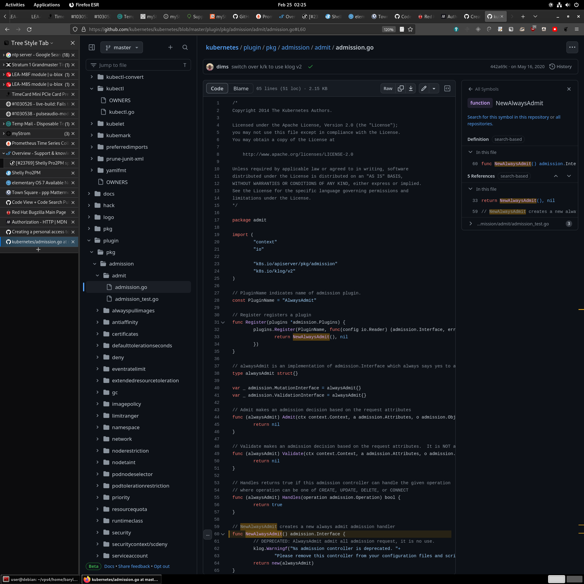
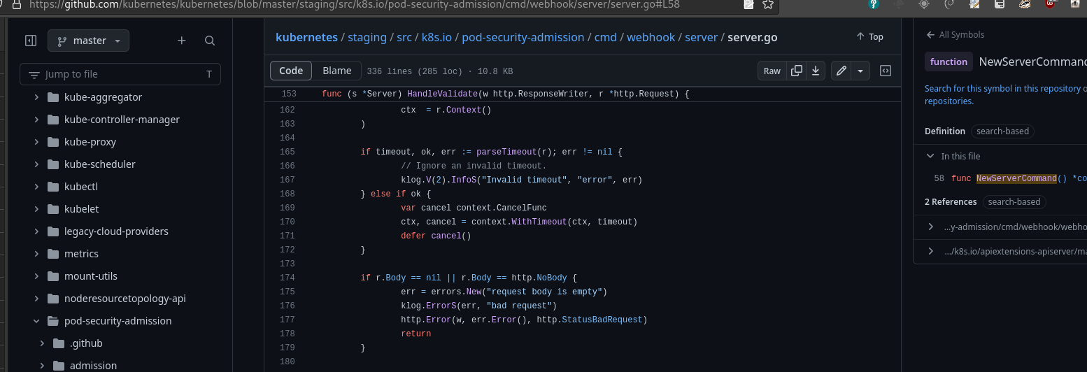
Really nice. Would love to relocate Symbol panel, from the right, to the bottom. It looks like it was designed with wide monitors in mind, but I work usually on narrow aspect ratios (4:3, 3:2, 1:1 - yes!, 10:16 - yes!, both at home, work and mobile). If I enabled something like side bars in my web browser (i.e. Tree Style Tab in Firefox), it gets even more narrow. It works great, but new github code view no so much. I am also more used to having it at the bottom from other projects and code searches, like Google Code Search. Example screen shot: Normal zoom level: A bit of zoom: For comparison here is google code search, at similar zoom level. Density wise, new Code View, is not great. Long lines are cut, symbol names are sometimes cut, and there is not much reference given. Also default width of a tab, is way too big. Make it configurable, and make default to be 2em. |
Beta Was this translation helpful? Give feedback.
-
|
Also this looks like a bug: (see first line of the code) It behaves wonky depending if you scroll up or down. Also I really do not like this behavior at all. |
Beta Was this translation helpful? Give feedback.
-
|
And I dislike intercepting Ctrl-F for showing popup for searching. It is incompatible with F3 and Shift-F3, and usually just slower than using browser search functionality. Yes, I know you can do Ctrl-F twice to bypass it. And I know that the popup search has scrollbar markers for matches. But in many web browser you also get it. Pressing Ctrl-F twice is not nice, due to habits of using normal search on other web pages. |
Beta Was this translation helpful? Give feedback.
-
|
Feedbacks:
|
Beta Was this translation helpful? Give feedback.
-
|
The new code view layout is now distinct from the root page of the repo (where the |
Beta Was this translation helpful? Give feedback.
-
The product is really amazing but I didn’t understand how does it sort the ranking of who’s repository would be above. |
Beta Was this translation helpful? Give feedback.
-
|
Mobile code viewer is too laggy in horizontal scrolling: 2_5221931803819912022.mp4 |
Beta Was this translation helpful? Give feedback.
-
|
Download button doesn't work |
Beta Was this translation helpful? Give feedback.
-
|
Accessibility concern: This is Firefox 114.0.2 on macOS Ventura 13.4.1 with the following zoom setting: |
Beta Was this translation helpful? Give feedback.
-
|
For the love of god is there any way to disable this nonsense? The blog post talks about how reading code is a "sometimes chaotic process" and this new UI seems to only amp up the chaos. I don't want doodads, popups, new panes, "smart" analytics, or whatever whiz bang feature seems to justify keeping on so many UI monkeys. I want to view the freaking code. Remember when Balmer did his "developers, developers, developers" chant? Try this one on for size: "code, code, code!". When I try to view a folder I don't want a directory tree taking up space. When I try to select text I don't want a whiz bang doodad off to the right popping up mysteriously offering to list symbols. Chaos aside, do you know the other reason I don't want a list of symbols (or whatever) popping up? Github does an atrocious job of indexing source, and I've already learned that the search is so broken as to be useless (and otherwise best avoided). I get that there were major performance issues before, but come on don't make the changes so intrusive. Let the performance speak for itself. You know what this does motivate me to do? Shallow clones so I can leverage a more usable editor locally without all the cloudy, artificial machine learning buzzword compliance that seems to be leaking into Github. P.S. There's even a broken (stuck on) tooltip that's rubbing salt into the wound. P.P.S. As I type this I'm watching the UI widgets below (a.k.a. "Attach files by dragging…" bounce up and down. This is one update that's best left for the circular file. |
Beta Was this translation helpful? Give feedback.
-
|
Javascript is now required to just view file, and there is no way to opt-out. WHY! WHY! WHY! |
Beta Was this translation helpful? Give feedback.
-
Beta Was this translation helpful? Give feedback.
-
|
A couple of bugs with Jump to line feature while on git-blame mode I've been experiencing on Firefox. First: using the enter key to go-to line will reload the page at the specified line but on code view (git-blame is lost).
Result: Expected: Second: using the 'Go' button on the go-to line modal scrolls the view to the right line but the URL does not update and the line is not highlighted.
Result:
|
Beta Was this translation helpful? Give feedback.
-
|
Revert this... give us sort option back! |
Beta Was this translation helpful? Give feedback.
-
|
The updates lately are rendering GitHub unusable. |
Beta Was this translation helpful? Give feedback.
-
|
please reverse this change already |
Beta Was this translation helpful? Give feedback.
-
|
Hey GitHub team , Recently, I have been noticed that the GitHub having an issue in counting the number of contributions my new commits are being recorded on 25th July 2023 and right now when I'm posting this comment its 26th July 2023 00:33 (UTC +5:30) |
Beta Was this translation helpful? Give feedback.
-
|
any update |
Beta Was this translation helpful? Give feedback.


-
This Discussion has been closed because it's outdated. To provide feedback on code search and code view, please click here.
Thanks for trying GitHub’s new code search and code view - the most powerful way to search and navigate the world’s code. Our team is excited to share this feature with you today in beta.
Now anyone can access the new search and code viewing experience using this link, or via the feature preview menu. To access the feature preview menu, click your avatar at the top-right of a GitHub page and select Feature preview. Then select the beta and click the Enable button.
We are dedicated to making GitHub the best code navigation experience on the web. If you encounter any issues or have suggestions on how we can improve the experience, please share below. We will review all feedback!
Beta Was this translation helpful? Give feedback.
All reactions