Just like you wouldn’t expect to design a building without a floor plan, you can’t execute a website without a wireframe. Or if you do, they usually do not last or convert.

The main reason is this: By creating a wireframe when building or redesigning a website, you can focus on the user experience as a separate (but connected) piece of the puzzle.
A wireframe enables you to test drive the page layout and evaluate user flows to see exactly how the new website will function and exposes any potential mistakes that might eventually hinder conversions.
In this post, I’ll discuss what the wireframing process looks like for websites, the types of wireframes you can use, and how to create a wireframe for your own project.
Table of Contents
- What Is a Website Wireframe?
- Why Create a Website Wireframe?
- When to Create a Wireframe
- When to Skip Making a Wireframe
- How to Create a Simple Wireframe
- What to Include on a Website Wireframe
- Wireframe Examples
- Mockup vs. Wireframe vs. Prototype
What Is a Website Wireframe?
A website wireframe maps out the main features and navigation of a new website design. It gives an idea of the site's functionality before considering visual design elements, like content and color schemes.

Layouts and features such as menus and buttons are mapped out to assess the end user's overall experience.
A website wireframe also provides a practical map of the project so that team members can see where everything will go as they complete related tasks.
Some designers or clients may tempt you to skip this part of the process, calling it unnecessary and time-consuming. But wireframing is about preparing yourself, and all good preparations require time. Also, working without a plan usually takes up even more time, and you risk a project failing altogether.
Why Create a Website Wireframe?
Creating a website wireframe enables you to identify and take every opportunity to improve your site’s functionality, ease of use, and convenience to delight your users. It can also help your design team collaborate better and gather client feedback before the design process is too far along.
Wireframes visualize website architecture.
Wireframes form the basis of your website’s structure or architecture — akin to how floor plans work for construction projects.
With a wireframe, you can visualize your website’s layout and structure before you get to the final product. The wireframe shows where core elements like navigation menus and content sections will be on your website.
Wireframes save time and resources.
Because all relevant departments are involved in creating a wireframe, changes at the later stages are less likely, thus saving time and effort.
It is also much easier to make changes in the wireframe phase, as it requires less effort than when you’ve moved on to the more detailed part of your website development.
Identifying any friction points at this stage of the design process is much more ideal than discovering them after you’ve decided on colors, fonts, and imagery.
.png)
Free Website Design Inspiration Guide
77 Brilliant Examples of Homepages, Blogs & Landing Pages to Inspire You
- Agency Pages
- Ecommerce Pages
- Tech Company Pages
- And More!
Download Free
All fields are required.
.png)
Wireframes encourage iteration and feedback.
Since wireframes follow a step-by-step process, giving feedback at each stage is easy. Wireframes lack detailed design elements, making it quicker to make changes depending on suggestions from stakeholders and team members.
Wireframes clarify website functions.
A wireframe shows stakeholders how each aspect of your website works. It also shows how you expect users to interact with your site from navigation to conversion.
By providing a glimpse into how visitors will interact with your site, a website wireframe can reveal any aspects of its design or functionality that could be improved to better assist users in reaching goals like making a purchase, signing up for a newsletter, or reading a blog post.
When to Create a Wireframe
You should always create a wireframe in the early development stages because it will help you reveal errors in judgment or design, giving you time to correct them. In terms of collaboration, you can use wireframes to work effectively with your team and explain concepts to your clients.
Some wireframes are more detailed than others. That’s why I think it’s wise to start with a low-fidelity wireframe. Low-fidelity wireframes show the general localization of elements on the screen. You can develop these initial designs into more high-fidelity wireframes, which provide more details — such as what the final elements will look like.
Whether you use a low-fidelity or high-fidelity wireframe will depend on what your project needs at the time.
When to Skip Making a Wireframe
I don’t recommend skipping the wireframe phase of web development. However, there are some situations where you might (big might) not need to make a wireframe.
When Designing a Small Website
Small websites or personal projects with a single purpose might not require you to create a wireframe. These websites usually have only 1-3 pages and no external stakeholders.
When Your Project Has High-Fidelity Needs
A detailed prototype works better than a wireframe when your project has high-fidelity needs. This is because clients might not get all they’re looking for in wireframes that aren’t too detailed.
How to Create a Simple Wireframe
1. Identify the goal of the website.
Before taking pen to paper to mock up a wireframe, you’ll find it helpful to understand the goal of your website. While it might seem obvious that you want to bring in as much traffic as your server can handle, I recommend thinking through what you want all those visitors to see and do while you’ve got their attention.
Should they end their visit with a purchase? Should they download an app? Perhaps you’d like them to view a certain page before dropping off to another website entirely. Whatever your goal is, ensure your team is aligned around it so that the subsequent steps flow smoothly until you take your site to production.
2. Understand the user flow.
Wireframes help you identify and evaluate user flows so that everyone on your team understands how the visitor should interact with each page on your site. During this step, I recommend outlining each entry point a visitor could use to land on your homepage and then choosing a few primary entry points to create a journey flow.
Before sketching a wireframe, I like to take some time to outline the user flow in a text format. Why? Moving steps around is easier and faster when written out rather than mocked up as a wireframe.
3. Determine your website wireframe size.
Your wireframes will need to vary depending on the screen size you’re creating them for. Mobile devices, tablets, and desktop screens will vary in size — not to mention you can scale the window on a desktop. I recommend using pixel measurements rather than inches or points to get the most accurate measurements for your wireframe.
Here are the standard sizes for each screen type:
Wireframe size for a mobile screen
1080px wide x 1920px long
Wireframe size for a tablet screen
8” Tablet - 800px wide x 1280px long
10” Tablet - 1200px wide x 19200px long
Wireframe size for a desktop screen
768px wide x 1366px long
4. Begin your website wireframe design.
Now, it’s time to visualize your user flow in a wireframe. If you’re using physical pen and paper, I recommend using dotted or grid paper to keep things aligned. This will help you more easily transform the physical version of your wireframe into a digital copy.
If you’re starting on a digital platform, choose a tool that works best for your wireframe fidelity needs. If you’re unsure whether to use low, medium, or high fidelity, check out this comprehensive wireframe fidelity guide.
5. Determine conversion points.
Once you’ve sketched your wireframes, it’s time to decide exactly how the user should move through each step. Just because you’ve outlined the steps the user should take doesn’t mean they’re intuitive. At this stage, you’ll determine what buttons, hyperlinks, images, or other elements on the page will guide the reader to the next step until they reach the expected end goal.
6. Remove redundant steps.
Wireframing is an iterative process. It’s rare to do a single round of sketching production-ready wireframes. You might notice some web pages are redundant and can be combined to create fewer clicks for the user. Wherever an opportunity exists to simplify your wireframe, sketch it out, and solicit feedback — that brings me to our last step.
7. Get feedback on the wireframe.
Your website will undergo several rounds of tests and revisions before it goes live, but getting feedback on your wireframes in the beginning stages is still a good idea.
Collaborate with your design and development teams, internal staff, and customers to get their opinions on the flow itself. I believe getting input during this stage prevents the essence of the UX from getting lost after adding buttons, screens, and page layouts to the mix.

HubSpot's Free Website Builder
Create and customize your own business website with an easy drag-and-drop website builder.
- Build a website without any coding skills.
- Pre-built themes and templates.
- Built-in marketing tools and features.
- And more!
What to Include on a Website Wireframe
For your wireframe to serve its purpose, it should contain the key elements I’ve highlighted below.
Page Hierarchy
Clearly outline how you want content to appear on your website and in the order of importance they should appear. Include key sections like headers, footer, and so on.
Content Areas
Your wireframe should show the different content areas you’re expected to have on your website. These content areas could include the hero section, categories, testimonials, videos, etc.
These content areas should work harmoniously to achieve your reason for creating the site.
Buttons and Links
Show where call-to-action (CTA) buttons are expected on your website. These CTA buttons should align with the action you want your users to take.
User Journey
If you’re creating a high-fidelity wireframe, you should include the expected user journey. A user journey mapping depicts the path users take from when they arrive on your website until they complete a specific action, such as buying something or downloading a lead magnet.
Notes
Notes or annotations give context to different elements on your wireframe. You’ll likely be showing the wireframe to stakeholders who don’t have a design or marketing background, and these notes will help them understand how the website is intended to work.
You can also use these notes to leave instructions or suggestions for other team members working on the wireframe.
Wireframe Examples
Below are some of the best examples of wireframe types I found to help you solidify the wireframing process that works for you.
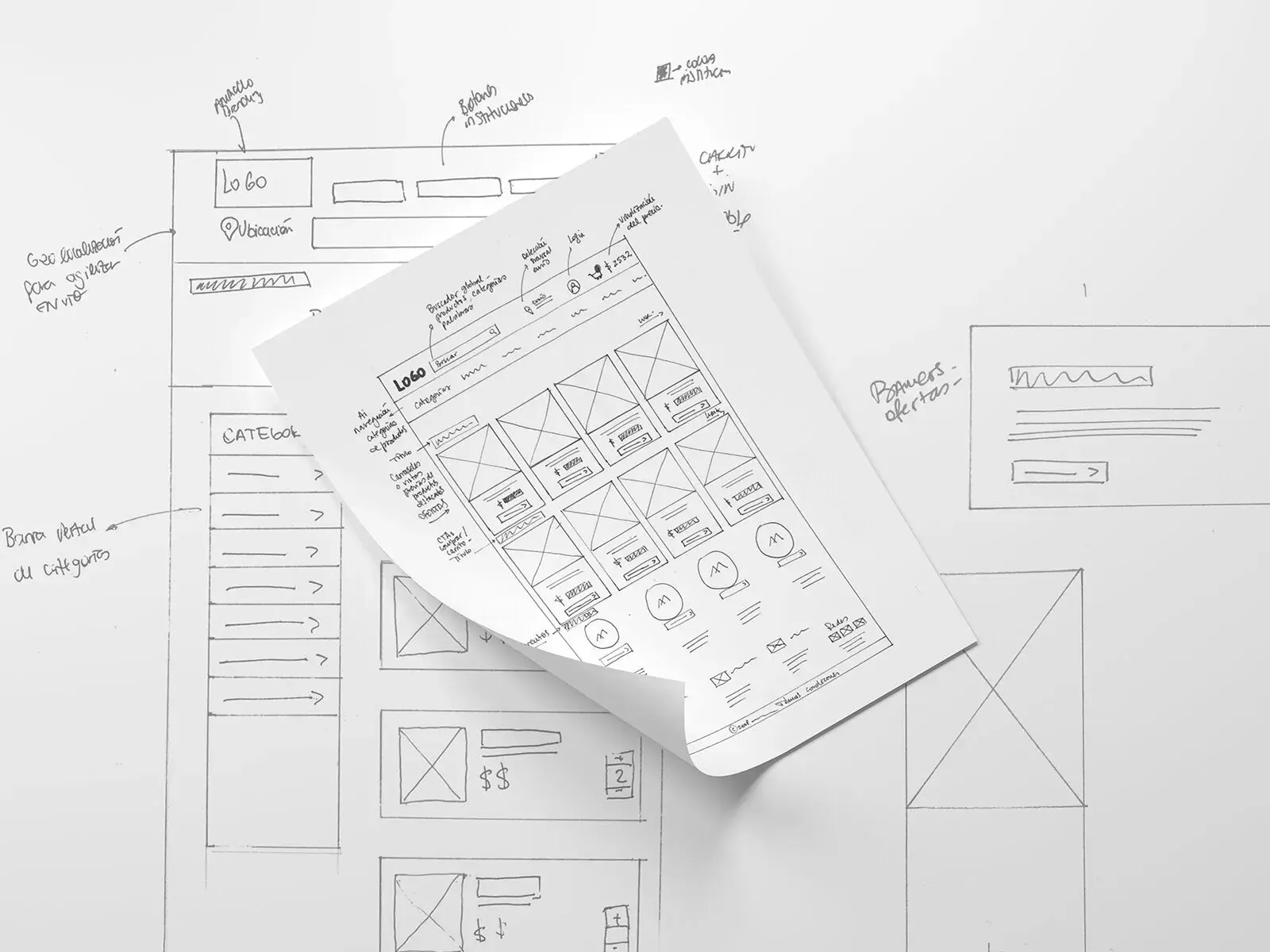
1. Sketch
Some developers begin their sketching with a pencil and paper or a whiteboard. This simple, hand-drawn method illustrates a basic concept before spending time fussing with graphical elements.
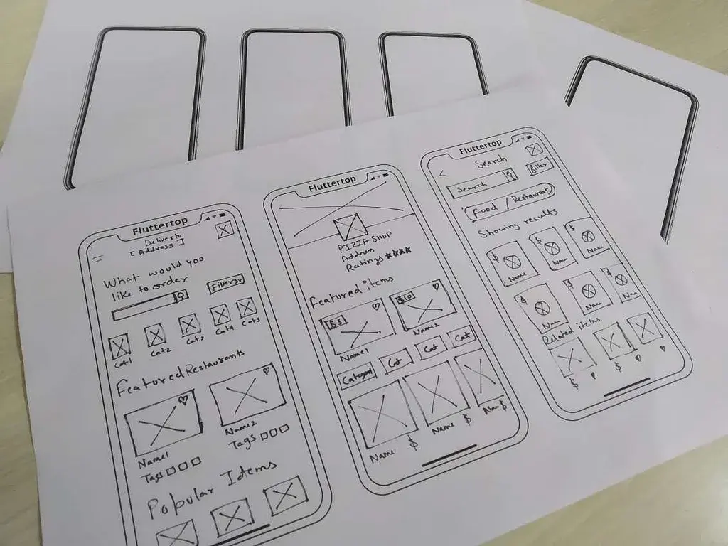
2. Detailed Hand-Drawn Wireframe
Hand-drawn wireframes don't always have to be simple. You can use a ruler in addition to your pencil and paper to create a more detailed design. However, using a digital wireframe tool for such detailed work might be more convenient since digitizing your hand-drawn efforts may be challenging.

3. Low-Fidelity Wireframe
Low-fidelity wireframes are created digitally and display elements in simple content blocks. They take your basic concept sketch and turn it into something more refined. Low-fidelity wireframes are important for determining what graphical elements need to be created and what copy needs to be written.

4. Low-Fidelity Mobile Wireframe
Don't forget that responsive versions of your website and mobile apps get wireframes too. Many designers even wireframe the mobile version first since website visitors are visiting sites on mobile more often than ever before.
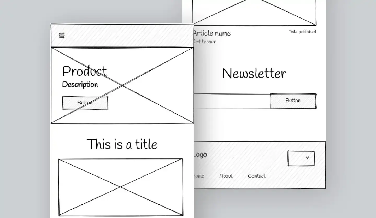
5. High-Fidelity Wireframe
Using digital tools, you can create a high-fidelity wireframe that illustrates in more detail without creating too many graphical elements. This results in a more aesthetic look without time-consuming design work that could be discarded in the review process anyway.

6. Low-Fidelity Interactive Wireframe
Websites aren't static, so why should your wireframe be? Many interactive wireframe tools can help you demonstrate your user experience flow before committing to your graphics.

7. Wireframe Mockup
Once the design's bones have been approved, you can create graphical elements to flesh out the design. This is called a mockup.

8. Interactive Wireframe Mockup
You can also use wireframe tools to create an interactive mockup without creating the actual site, complete with a UI Kit and graphical elements. This step can be helpful if you have a design team handing off the site implementation to developers because they can review both the intended look and functionality of the site, resulting in a more streamlined workflow with fewer revisions needed.
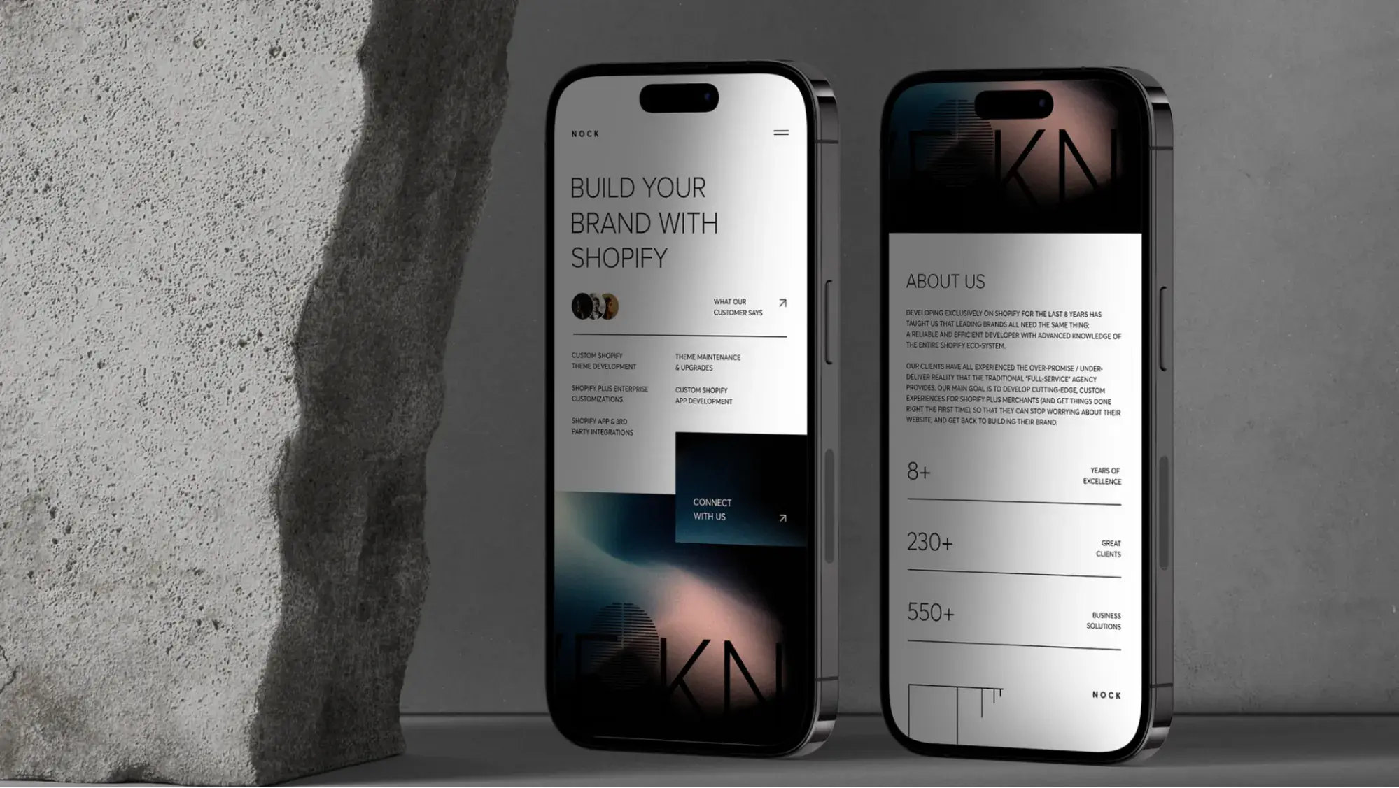
These are just a few examples, but they show how website wireframing can be achieved in different ways.
9. Free Website Wireframe
If you’re on a budget, you can explore free website wireframing tools like Miro. These free tools give you the basic wireframe capabilities that work great for low to medium-fidelity mockups.

10. Mobile Website Wireframe
Mobile responsiveness is an essential web design best practice. Creating a wireframe for the mobile version of your website specifically is a key step for a successful website in general. By prioritizing mobile web design, you’ll fare better with UX, SEO, and conversions.
There are a few different approaches to building a mobile wireframe. Consider condensing all of your desktop features to fit onto a mobile screen. Or limit some functionality altogether to yield a mobile-friendly experience.
Mockup vs. Wireframe vs. Prototype
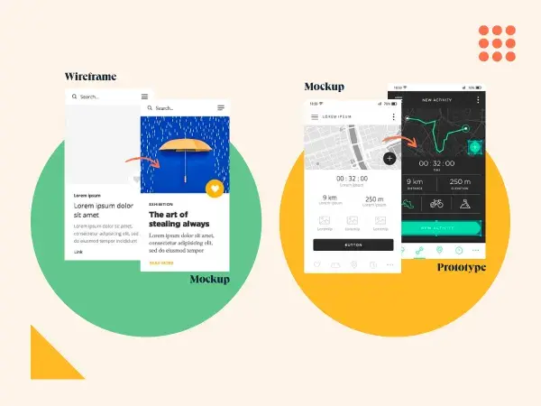
A wireframe is the first step in communicating your website ideas to others. It provides a basic foundation from which others can see and understand. A mockup goes a step further, illustrating the expected appearance of the product. After a wireframe and mockup have gone through the design approval process, can you then create a prototype.
Prototypes provide even more detail about the website design, revolving around the feel of the website for the user and basic functionality — such as demonstrating what an element looks like when you hover your mouse over it.
Wireframes, mockups, and prototypes are similar pieces in the website development process and involve design steps that happen in close succession to one another. Sometimes, they can overlap depending on the designer’s needs.
This explains why some people need help understanding the differences between these three concepts.
So, what's the difference between a mockup, wireframe, and prototype?
The best way to summarize the difference between a mockup versus wireframe versus prototype is by illustrating an example: where a wireframe shows a blank rectangular box, a mockup shows a resulting blue button, and a prototype shows what it looks like when it's clicked.
Here's an example of a wireframe versus mockup and a mockup versus prototype:
How a Website Wireframe Improves the Design Process
If you want a functional website, you must first start by making a proper plan for executing the design. As I’ve illustrated with these examples, a wireframe can help you easily map out the elements of each page and make changes as you see necessary.
I recommend starting with a low-fidelity wireframe and adding details gradually. If you decide to use a wireframing tool, take your time to find one that meets your specific needs.
Editor's note: This post was originally published in November 2023 and has been updated for comprehensiveness.
.png)
Free Website Design Inspiration Guide
77 Brilliant Examples of Homepages, Blogs & Landing Pages to Inspire You
- Agency Pages
- Ecommerce Pages
- Tech Company Pages
- And More!
Download Free
All fields are required.
.png)


![Copyright Notice Examples: How to Write One for Your Website [+Template]](https://knowledge.hubspot.com/hubfs/copyright-notice-1-20241010-1359425.webp)


![Website Monetization Basics [+ 7 Expert Strategies for Success]](https://knowledge.hubspot.com/hubfs/website-monetization-1-20241007-9297556.webp)
![It’s Refresh Time. Here’s How to Update a Website [+ My Pro Tips]](https://knowledge.hubspot.com/hubfs/how-to-update-a-website-1-20240927-7786141.webp)