Tour an 18th-Century English Farmhouse With Pattern and Color in Every Room
All products featured on Architectural Digest are independently selected by our editors. However, when you buy something through our retail links, we may earn an affiliate commission.
After living in Paris, Miami, New York, and London, Jason and Amanda Howard were ready for a more pastoral life. In recent years, the couple had rented a weekend cottage in Wiltshire, a corner of southern England known for its “chalk downs”—rolling limestone hills—and grew very fond of its quiet beauty. They also enjoyed the easy two-hour drive from London, where their two kids went to school. Once their youngest left for university in 2020, they decided to move to Wiltshire permanently, and began looking for a property with enough space to host family and friends. “I always wanted to live in the country,” says Amanda, a former model who used to travel the world on assignments with Ralph Lauren, Givenchy, and Armani.
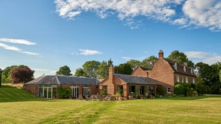
During their search, Amanda and her husband, a reinsurance executive, heard about an old farmhouse whose owner was open to selling but did not want to deal with any real estate agents. The owner also did not want to let anyone inside, on account of the pandemic. The Howards took a look at the exterior of the house, an 18th-century redbrick construction with sash windows and Dutch gables, then walked around the grounds—a vast green field with views for miles—and decided to make an offer on the spot. “It was a dream,” says Amanda. “The location and the land were just beautiful.”
Even without having set foot inside, the couple knew there would be renovations involved: Someone had to build their dream kitchen, the one where they envisioned cooking elaborate Sunday roasts. They called Sarah Vanrenen, an interior designer known for reviving historic homes with creative color palettes and layered textiles. Vanrenen and her design partner, Lauran Hanbury, work out of a studio in the town of Hungerford, just 15 minutes away from the Howards’s newly purchased farmhouse.
When the new owners were finally able to set foot inside, they found a tired aesthetic, yet they also saw a 9,000-square-foot layout with plenty of possibilities. There were two annexes built around 1990, one as an indoor pool pavilion and the other as a garden room, or conservatory, which the designers identified as the ideal spot to create a spacious modern kitchen. “We completely knocked down the conservatory and rebuilt the kitchen structure along with a large boot room, pantry, and laundry room,” says Vanrenen. “The old kitchen was made into a prep space for the client, who is not only the most glamorous but also incredible cook, and along with her husband make the most generous hosts in the area.”
Elsewhere, the renovations were just as transformative. Except for the main entrance hall and the placement of certain rooms, which stayed the same, the designers reimagined the whole home, repositioning doorways, adding fireplaces, closets, and new finishes. To create character in the dining room, the design team installed paneling on the lower walls, built a faux fireplace with a marble mantle, installed a “wacky” wallpaper featuring big strawberries and vines, and painted the ceiling a glossy orange hue from Edward Bulmer. “The orange gloss was way out of my and my husband’s comfort zone,” says Amanda. “But my goodness, when the candles are on it looks stunning at night.”
While honoring her clients’ rather traditional style, Vanrenen pushed them in more daring directions a couple of times. In the primary suite, for example, the couple wanted an upholstered canopy above the bed and had some antiques they wanted to use. So the designer added a wallpaper and rug with bold geometric patterns in lime and moss green to keep the room from looking “fuddy-duddy.” A similar approach is seen in the main living room, where Vanrenen, who has her own line fabrics and wallpapers, juxtaposed a multiplicity of textiles, from classic floral patterns to strong stripes and exotic embroideries.
After finishing the project, Vanrenen received one the highest compliments a designer can ever get: an invitation to stay over. “We have become really good friends,” she says. “It was so wonderful to actually experience what other guests experience.”

