Ugly Dumpling
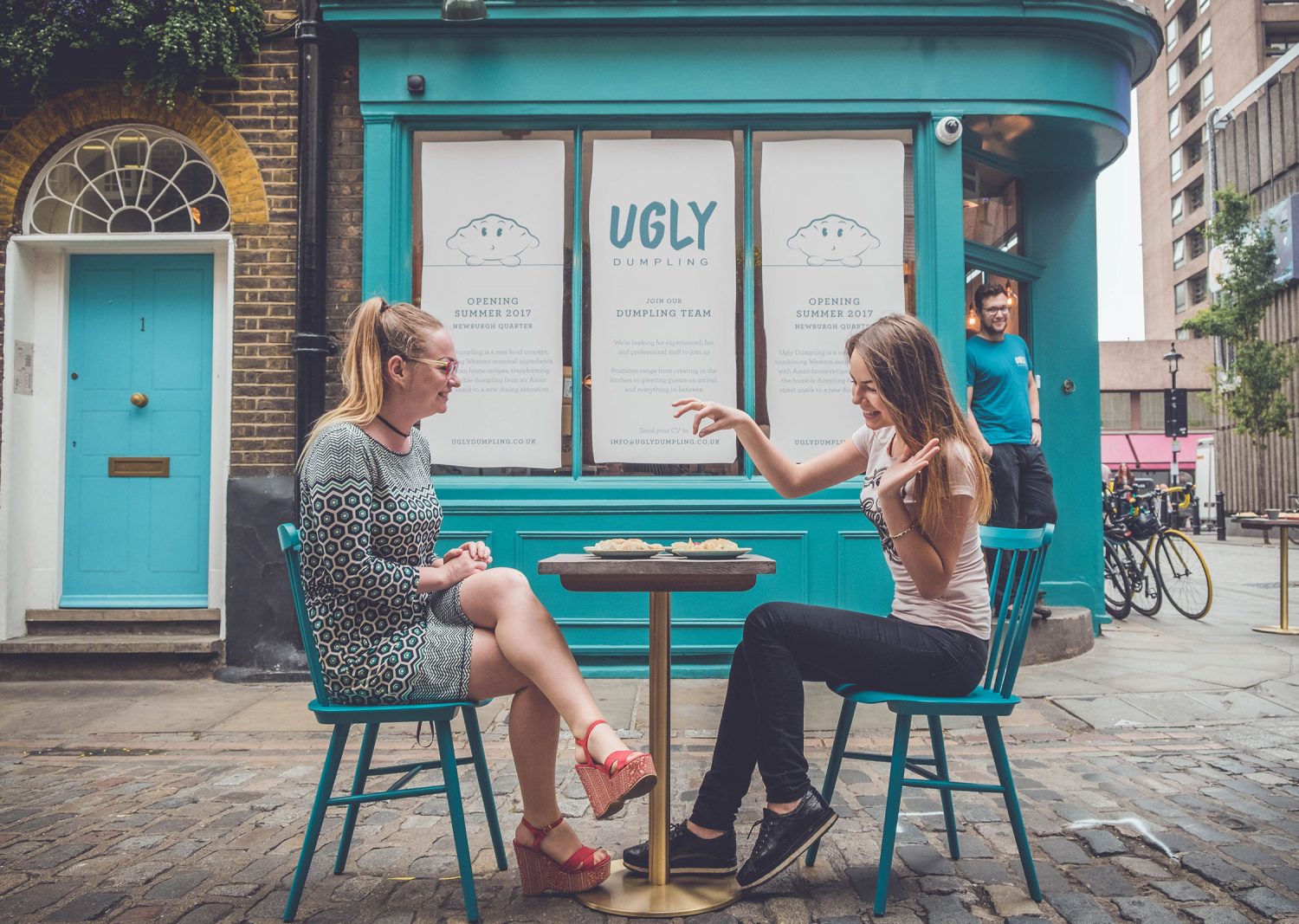
Serving familiar fillings alongside some new favourites – from cheeseburger to fish and chips – the Ugly Dumpling team are on a mission to turn this humble street food into a unique dining experience.


Building a brand identity online
Reflecting the authentic, inviting and easy nature of the Ugly Dumpling dining experience, the website needed to be simple to use with only the good stuff that customers expect from a restaurant website.
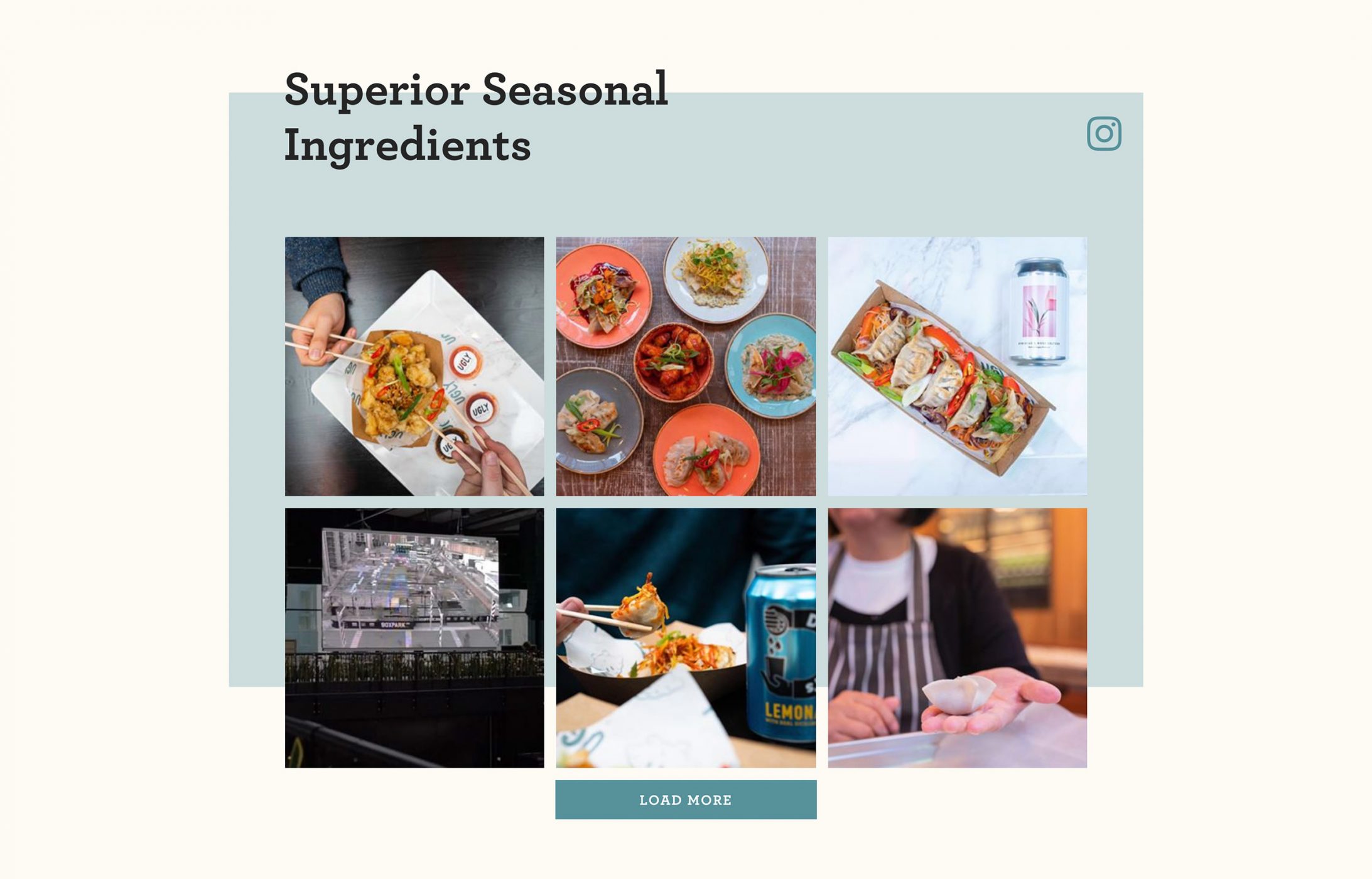
The homepage was designed with key features such as a hero banner carousel for promotional messaging, quick links to social media channels and plenty of mouth-watering imagery.
Seeing as the Ugly Dumpling guys know a thing or two about creating instagood photos, we included an Instagram feed as one of the key homepage features which has the added bonus of injecting a fresh dose content as and when the team update their social channel.

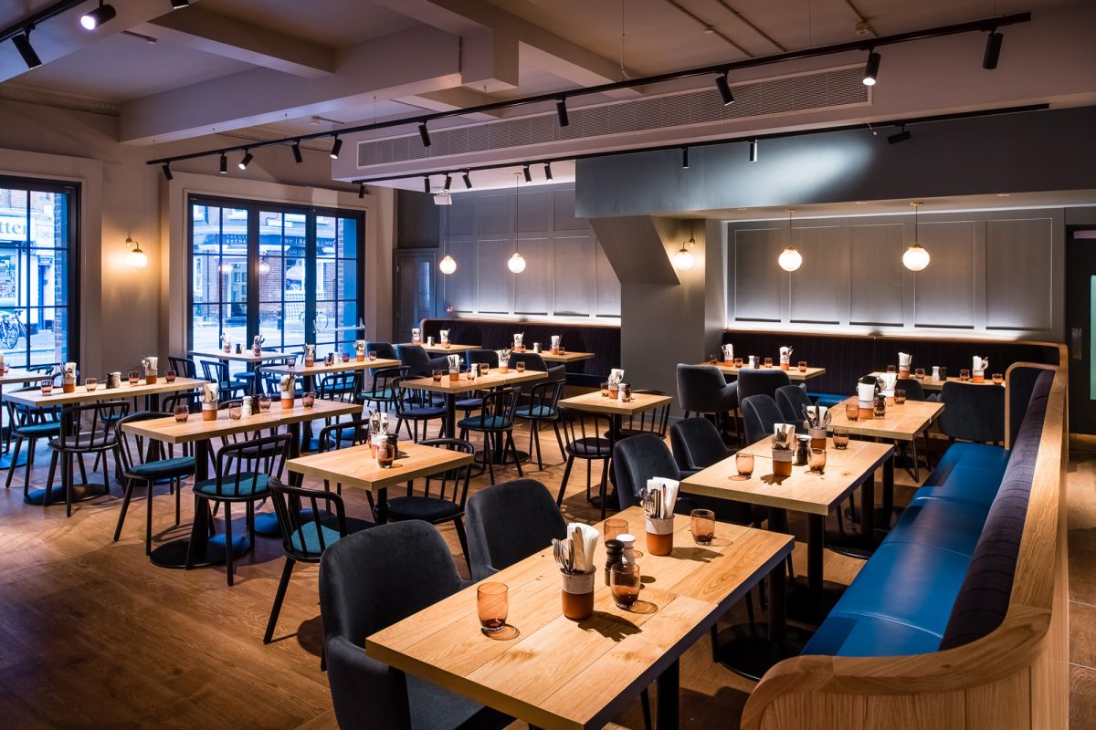
As soon as we saw Des (the dumpling), we knew he was going to be a favourite feature of the brand and made sure to use him subtly but effectively in the website design. We also took the colour palette which had been created by the brand agency and applied it to the site design to ensure a consistent look and feel which would be reflected in other touch points such as the menus and restaurant interiors.
Other features include an online booking widget and downloadable menus all easily found via the main navigation or cleverly placed CTAs throughout the site.

An easy to use and scalable CMS
Simplicity was important for the back end of the website too. We developed the site on our widget framework which meant the bespoke homepage and standard pages we designed could be easily edited and updated from the CMS.
The site is scalable too so as and when the team open new pop-ups or sites, it’s easy to let their customers know and create fresh, new content.


