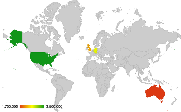
Use a geo chart to show a map of a country, continent, or region. The values for each location are shown with colors. For example, create a map that shows the population of countries in Europe.
Learn how to add & edit a chart.
How to format your data
- First column: Enter location names or region codes.
- Second column: Enter numeric data. You can also add a category name (optional).
- Rows: Each row represents a different location on the chart. You can also add a category name to the rows, instead of the columns (optional).
Examples
Sales per country

| Region | Sales |
|---|---|
| United States | $3,500,000 |
| England | $2,200,000 |
| Australia | $1,700,000 |
| Germany | $2,700,000 |
Coffee production

| Country | Coffee production |
|---|---|
| Brazil | 30% |
| Vietnam | 20% |
| Columbia | 20% |
| Indonesia | 15% |
| Ethiopia | 10% |
| India | 5% |
Other types of Geo charts
Geo chart with markers
Use a geo chart with markers when you want to show data for a location using a circular marker. The marker size is based on the data for each location.
How to format your data
Format row and column data like a geo chart.Example
Internet usage
| Country | Internet usage |
|---|---|
| United States | 30% |
| Germany | 25% |
| France | 20% |
| Taiwan | 10% |
| Netherlands | 5% |
| United Kingdom | 10% |
Customize a geo chart
- On your computer, open a spreadsheet in Google Sheets.
- Double-click the chart you want to change.
- At the right, click Customize.
- Choose an option:
- Chart style: Change background color or font.
- Geo: Choose a region or change location colors.