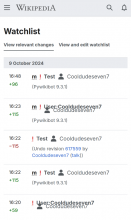
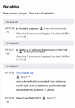
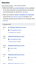
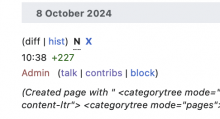
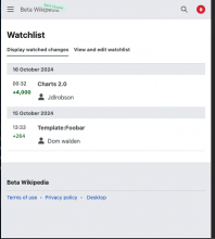
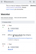
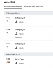
Since 1.43.0-wmf.26, on the mobile watchlist there is noticeable overlap between page names and usernames. The issue has been reported on itwiki. The screenshot below is from testwiki using safemode=1. Caused by T375975
Steps to replicate the issue (include links if applicable):
- Login and disable advanced mode (the default experience)
- Visit Watchlist
- usernames are on wrong line
What happens?:
Items flushed together
What should have happened instead?:
Items stacked on different lines
Software version (on Special:Version page; skip for WMF-hosted wikis like Wikipedia):
Other information (browser name/version, screenshots, etc.):
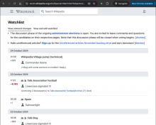
It does not happen using advanced mode.
Requirement
Ensure that on the mobile watchlist, usernames are displayed on separate lines and do not overlap with page names. The issue of text overlap must be resolved, and usernames should be properly stacked in non-advanced mode.
BDD
Feature: Prevent text overlap on mobile watchlist

  Scenario: Display usernames correctly in mobile watchlist
    Given the user has disabled advanced mode
    When the user visits their watchlist
    Then usernames should be displayed on separate lines, not overlapping with page names
Test Steps
Test Case 1: Verify Correct Display of Usernames in Mobile Watchlist
- Log in to the test environment and disable advanced mode.
- Visit the Watchlist page.
- AC1: Confirm that usernames are displayed on separate lines without overlapping with page names.
QA Results - Beta
| AC | Status | Details |
|---|---|---|
| 1 | ✅ | T376814#10232175 |
QA Results - Prod
| AC | Status | Details |
|---|---|---|
| 1 | ✅ | T376814#10257284 |


