If you decide to search for the top five frontend frameworks today, there is a high probability that Bootstrap will be mentioned among them.
This is no coincidence, as Bootstrap has consistently offered immense value to developers who use it.
Bootstrap was officially released in 2011, and has gone through various changes and updates in order to become the stable and reliable framework that it is today.
Let’s discuss what exactly Bootstrap is, and why it is so popular.
Bootstrap is an HTML, CSS, and JavaScript framework that helps developers build mobile-first responsive websites in little to no time. Bootstrap does the background work for its users, which leaves them with more time to focus on the website design and how they want their website to appear.
Bootstrap has been used to build many great websites such as Taskade.com, CRIT-research, saleor.io, Super Mario Odyssey, and many more.
To see some more amazing websites created with Bootstrap, you can check out this link for Bootstrap website examples.
By calling Bootstrap a framework, It means that it was created to be part of the building blocks of the application being built, and it can be customized to one’s own taste and style. Frameworks like Bootstrap do not function on their own — we still need to write code that utilizes the framework’s features.
Now let’s talk about why Bootstrap is as popular as it is.
In the developer community, and the world at large, documentations are like maps: official guides on how something works and the ways in which it can be used. Bootstrap has a very impressive documentation. Extremely detailed, and beginner friendly.
A person new to Bootstrap can visit the website and get started with its features in less than ten minutes. Its features are well explained, and visual examples as well as code examples of how it works are included in the documentation. You get to see how features work, the code responsible for creating such features, and a visual representation of that code on a web page.
There are so many Bootstrap components ranging from Jumbotron, a lightweight component used to showcase key marketing messages on a site, to Carousels, which are “slideshow for cycling through a series of content.” With such a feature-packed toolkit, it gets quite easy for a new person to become overwhelmed. However, the documentation takes care of that issue with well explained, easy to understand writing that makes you want to start using Bootstrap immediately.
We all thrive when there are people backing us and when we have a community that we can go to whenever we have issues or want to display something new that we came up with. Bootstrap provides just that for developers when it comes to community.
Due to being around for quite a while, it has gathered a lot of users who have become near experts or even experts when it comes to using Bootstrap. This makes it easier for newbies to get help when they ask for it, and also to solve problems they come across when using the toolkit.
When you surf the net for Bootstrap tutorials, you will find hundreds of them. There are a lot of tutorials to guide users on how to use Bootstrap, and on how to customize it in order to create amazing pages. However, this does not mean that the documentation does not do enough. Rather, it shows that people have learnt from the documentation, and have also found new ways to achieve various things that they now want to share with the world.
On Bootstrap’s website, there is also a link to a Slack channel, which is for all things Bootstrap. You will easily see a lot of groups and communities on the Internet dedicated to working with Bootstrap and helping beginners advance in their Bootstrap journey.
One of the amazing features of Bootstrap is its grid system and the responsiveness that it offers. When used appropriately, Bootstrap makes responsive design relatively easy.
Bootstrap operates a 12 column grid system, which gives users the freedom to customize their pages differently for various device view widths.
For instance, one may decide to make items on a page occupy the full view width on smaller screens and a quarter of the device’s width on extra large screens. This comes naturally with Bootstrap, so there is no stress when trying to implement the feature.
Bootstrap has the ability to make its components, images, and the webpage as a whole responsive through the use of its predefined class prefix.
Its responsiveness caters for all screen sizes ranging from extra small to, medium, large, and extra large.
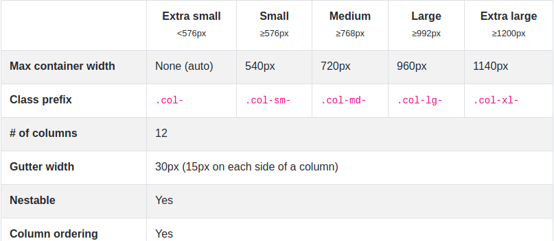
Responsiveness is an extremely important feature, because now, more than ever, there are many different devices used in viewing websites and web applications, and a website that is not responsive creates a bad user experience. Using Bootstrap’s grid system makes responsiveness one less thing to worry about while working.
Bootstrap has a really powerful and responsive Navbar. This is no small feat because navigation bars are like the welcome mats for web pages. It is that thing which calls your attention to it, and leads you to other sections of the website. Beautiful navigation bars are attractive and leave website visitors feeling pleased. Navigation bars are also meant to be easy to understand and to use.
Navigation bars are one of those features of a website that are not entirely easy to build. You need to decide how you want it to look, the structure of the Navbar, as well as components that it will contain such as logos, search bars, among other things. With Bootstrap, there is no need to worry about building it from scratch. Bootstrap offers Navbars which come with built-in support for a handful of sub-components that you can choose from and customize to your taste. Some of these subcomponents include:
navbar-brand which is a space for your company’s brand, name or image.navbar-nav for a full-height and lightweight navigation (including support for dropdowns)form-inline for any form controls and actions.navbar-text for adding vertically centered strings of text.collapse.navbar-collapse for grouping and hiding navbar contents by a parent breakpointBelow is an example of a Navbar that includes all the subcomponents in both mobile and desktop mode:


Did I mention that these Navbars come fully responsive? Well, they do. Responsiveness of the Navbar takes away a lot of stress that could come with trying to make it aesthetically pleasing to the eyes on all devices: either big, medium, small, or extra small. Bootstrap Navbars are your go-to components when you want to create something functional and responsive without spending a lot of time on it.
Bootstrap has a wide range of components to choose from. Its components range from cards to carousels, to buttons, and even complex forms equipped with validation. These components make the process of building web pages a straightforward one. If you want a form in your website, you simply import it and customize it to your taste.
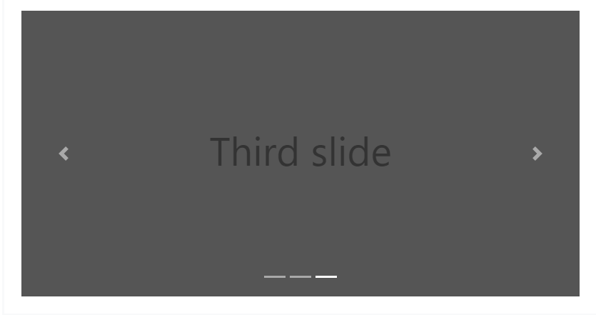
Components like carousels used to be quite difficult to implement, but with Bootstrap, it comes out of the box, and with a variety to choose from.
There are carousels with next and previous controls, some with indicators to show what slide you are currently viewing, and even carousels with a fade transition effect. So all you would need to do is choose the type of carousel you want, and include your images or whatever you want in their appropriate positions in the carousel, then voila! Your slide show is ready.
Providing many components and making them fully customizable is an amazing feat on Bootstrap’s end. There is also a component known as Jumbotron.
On the Bootstrap website, Jumbotron is introduced as “a lightweight, flexible component for showcasing hero unit style content”. It is used in instances when you want to showcase certain content — when you want that content to stand out. With Jumbotron, the heading text used is bigger than the default H1 we are accustomed to. Jumbotron uses the display heading. The Bootstrap display heading ranges from Display-1 to Display-4, the former (Display-1) being the largest display size.
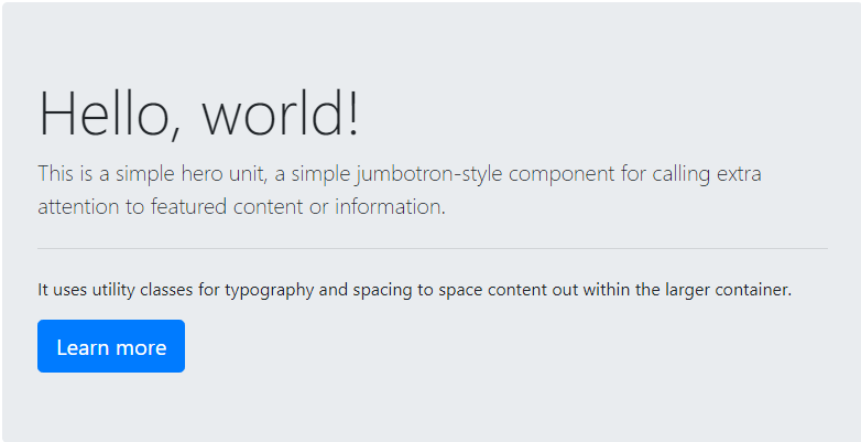 Jumbotrons are great for hero styled sections which may include images, texts, and buttons.
From the great usability to the extensive range of available features it provides, we can clearly see why Bootstrap’s popularity is still on the rise and not fading anytime soon.
Bootstrap releases updates periodically, which means that it remains up to date and keeps on getting better with every release.
Many other frameworks have come into the spotlight, but Bootstrap has remained significant over the past years.
The ease which it provides its users is quite laudable, and the fully customizable components makes web development a little bit easier, and faster for all.
You can always check out the official website at getbootstrap.com to get yourself familiar with Bootstrap.
Debugging code is always a tedious task. But the more you understand your errors, the easier it is to fix them.
LogRocket allows you to understand these errors in new and unique ways. Our frontend monitoring solution tracks user engagement with your JavaScript frontends to give you the ability to see exactly what the user did that led to an error.
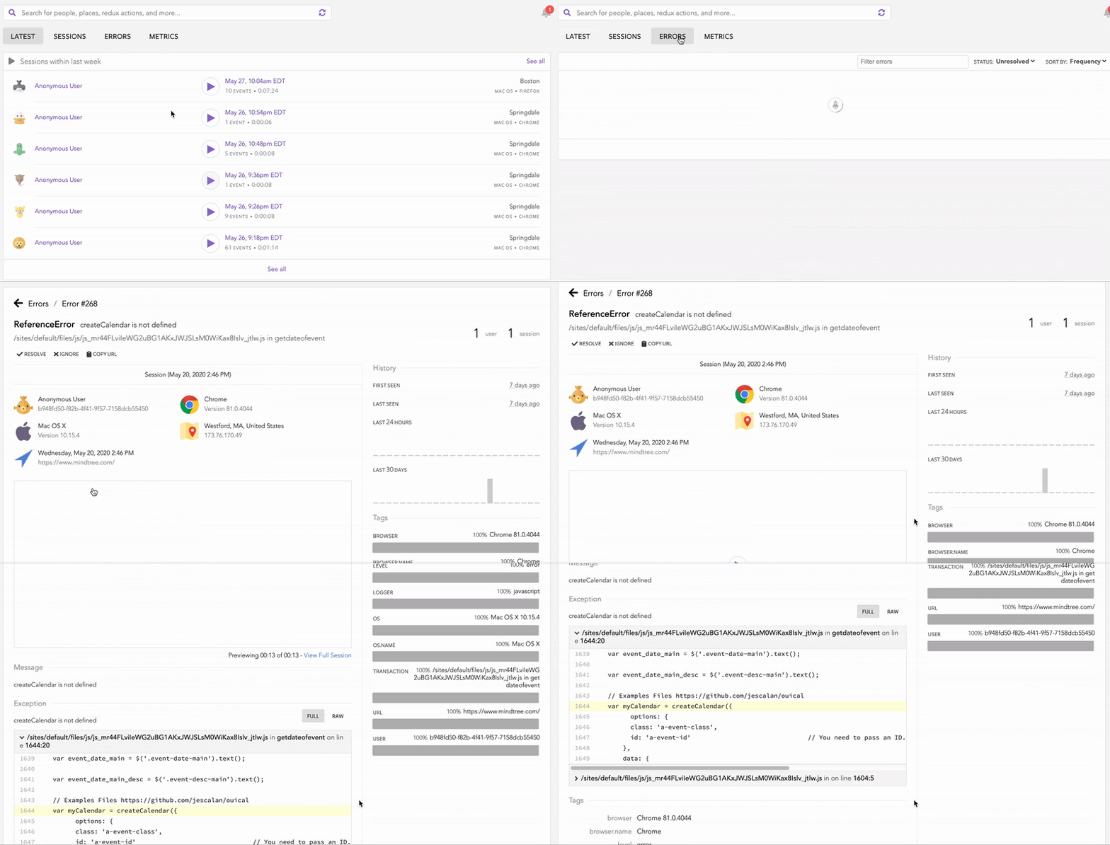
LogRocket records console logs, page load times, stack traces, slow network requests/responses with headers + bodies, browser metadata, and custom logs. Understanding the impact of your JavaScript code will never be easier!
Hey there, want to help make our blog better?
Join LogRocket’s Content Advisory Board. You’ll help inform the type of content we create and get access to exclusive meetups, social accreditation, and swag.
Sign up now
Fix sticky positioning issues in CSS, from missing offsets to overflow conflicts in flex, grid, and container height constraints.

From basic syntax and advanced techniques to practical applications and error handling, here’s how to use node-cron.
The Angular tree view can be hard to get right, but once you understand it, it can be quite a powerful visual representation.
Build a fast, real-time app with Relay 17 to leverage features like optimistic UI updates, GraphQL subscriptions, and seamless data syncing.