Dragging and dropping something is such a common gesture on graphical interfaces that we don’t even notice it. Whenever something must be moved, most users will press it and try to move it around with their fingers or mouse.
Drag and drop is used to organize our home screens, to put a document in the right file, and to upload things online. Such a common feature should be easy to design, yet a lot of applications, websites, and software are failing to make relevant drag-and-drop features.
One bad case of drag-and-drop is found in Excel. The most famous table software used by millions allows users to modify a lot of things directly with the mouse.
The problem is that too much can be done with the same gesture. The zone for each action is small and very specific, making it hard to discover. The interface changes are too similar from one action to another, making it hard to remember.
Typically, here is what happens: the user, who is not an expert, needs to switch column A and column B. He selects one column and places the cursor somewhere where it changes to become an arrow. He drags the selected column and instead of switching places, the selected column becomes bigger, or copies its cells into another column, or a second column is selected.
Excel is famous for being hard for beginners. The drag and drop is very useful but because it’s not clear enough, beginners tend to use alternative solutions that take more time but are more reliable:

On the other hand, Trello is an application that revolves a lot around drag and drop and does it very well. Each card can be moved from one column to another with ease, the user is never lost thanks to visual cues that help to understand the different states of the application. Alternatives to drag and drop are present and the logic works both on desktop and mobile.
Trello has thought through every little tricky detail that makes a difference and nailed everything in its way.
Designing is asking tricky questions to decide how something must work. If designers ask enough questions, things will work out. In the case of drag and drops, the list goes as follows.
First: Is drag and drop the best kind of interaction for what the user needs to do? We tend to reproduce what we are used to, but as designers, we need to be sure that a function we develop will be useful, used, and expected by the users.
Drag and drops are good for organizing lists, creating tables, and uploading files. They’re instrumental when we let the user personalize their interfaces. But sometimes a simple click will do the job. It’s an important question to ask to manage responsiveness.
Second: If drag and drop is the best kind of interaction, how do we make the function discoverable and affordable? Depending on what the user wants to do with drag and drop, you should design more or less clues.
In the case of moving a shortcut on the desktop homepage, designers don’t give a clue because it’s a seemingly obvious option. In the case of large list of things like in Gmail, designers made small dots to give a sense of roughness on an element, which should pique the curiosity of the user and help them discover the possibility of moving things around:

Once the feature is known, what kind of alternative design should you offer? It’s mandatory in most cases to offer an alternative way to interact with a draggable element.
Drag and drop will impact accessibility for everyone. Some users can’t use a mouse, some won’t see the screen, and some need more time to process what is happening. Trello is a prime example of a good alternative as by clicking on a card and using their menus, the option to move it by clicks is always here.
Finally, what kind of states and feedback are necessary? Drag and drop is a simple movement, but it will imply a lot of states to understand what is happening.
Grabbing, moving, anticipating the drop, dropping, appreciating the result. For each action, users must get feedback to prevent mistakes.
A well-designed drag and drop follows several rules to create its states and always gives feedback. Whatever the drag and drop is used for, you should take these states into account.
The first state before any action is the standard state. What is important to design is affordability. Email services tend to use icons with dots sometimes called kebab icons to hint that more actions are available.
On mobile, we don’t make any indications on the initial state. Users have to discover by themselves that holding an icon initiates a different state or use options to activate a different mode.
With mobile devices using the finger directly, drag and drop is more natural and easy to discover than on a desktop. Some layouts like cards or tables don’t need hints either because users expect to use a drag and drop to reorganize things.
When the cursor hovers over a grabbable area, you should create some change to indicate that an action is possible. The hover states only apply to desktops, not mobile.
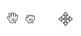
For instance, Apple and Microsoft both have a set of cursors to indicate that something can be grabbed:
In a list, shadows can appear around the hovered element, and the drag area can change color or make the grab icon appear.
The element is grabbed. The movement phase initiates. Depending on the kind of action we want to accomplish, the feedback won’t be the same. The important part of the grab is to show the initial state, and by using transparency, show that things are moving.
In a list like Gmail or Trello, the element stays in place but another version follows the cursor. Gmail uses one generic label with a strong color and the text “move one conversation” next to the cursor. The color is also applied to the element in the list.
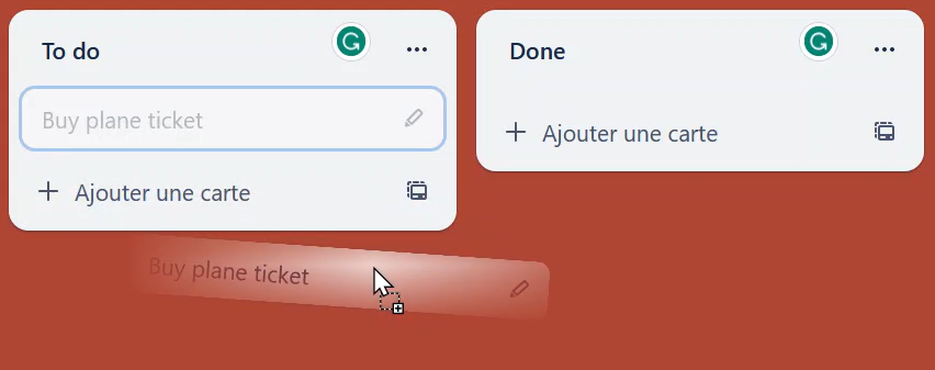
Trello uses transparency and reproduces the grabbed element under the cursor. In the list, the element gets transparent.
In the case of multiple selections, adding a number on the cursor is enough as long as the listed elements appear different than the non-selected element in the list
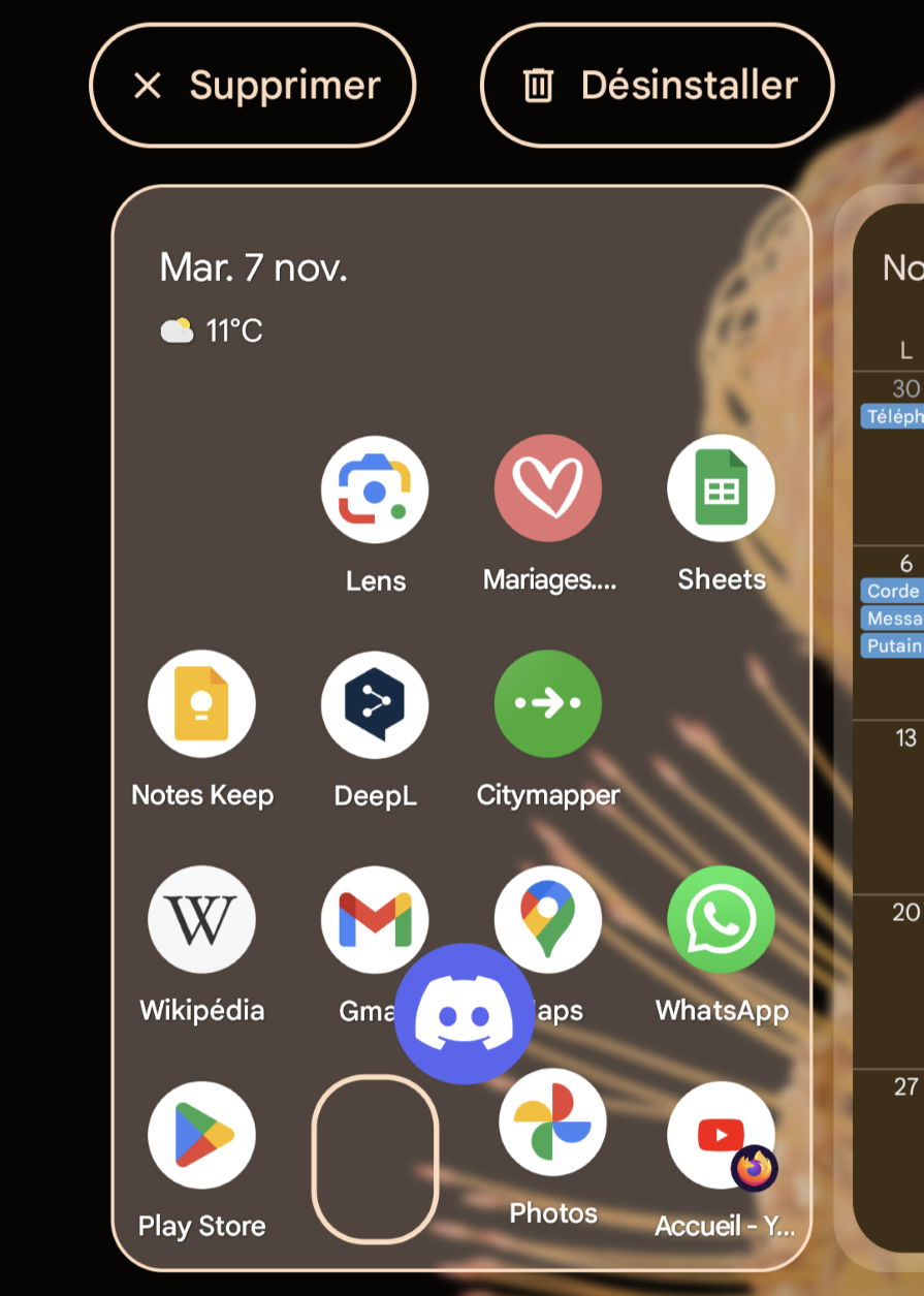
On mobile, you can use shadows to create a sense of depth between the grabbed element and the others. We see that while moving icons or resizing pictures on mobile:

When in motion, the same recommendation as the grab state applies. Users want to know if moving an element around will have a visual impact on other elements.
Moving an icon on a desktop homepage doesn’t move other icons, but doing the same on an iPad will push the icons over to make space. Generally, it’s good to visually move things if it’s a table or grid layout.
To drop an element, the user must anticipate the result. When their element approaches a new zone, the user must know what will happen. Is it a forbidden drop space or an allowed drop space? Will my selection move other items in the list, will they fuse, etc.?
If multiple possibilities coexist, the best way to handle it is to give written warning of what the outcome would be if the element is dropped. If only one possibility exists, the best is to show visually what will happen.

You must give feedback after the element drops. On desktop, the best way to handle a post-drop state is to give a notification explaining what was done and give a cancel or undo button.
Now, we have an idea of what goes into designing drag and drop. But what can the drag-and-drop function be used for?
Resizing an element almost always relies on drag and drop. It’s easier for users to have a visual representation of what they are modifying instead of asking them to divide or multiply a size. A resizing drag-and-drop feature is activated on specific occasions, it’s not possible to let users resize every element on a UI.
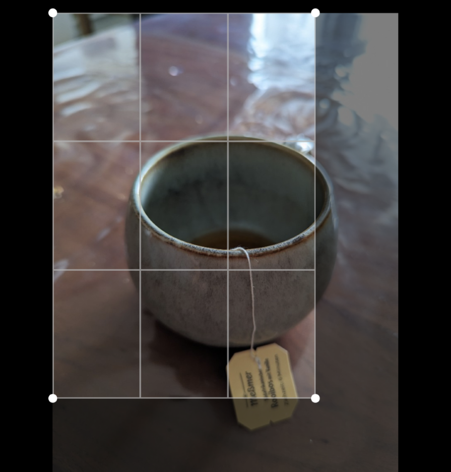
On desktop, this functionality is represented with arrows that appear on the side or corner of an element; users can easily misunderstand an arrow to indicate moving the element around like on Excel. On mobile, this functionality is managed with the fingers and must be symbolized by a change on the screen, like when resizing a picture:
Reordering is a way to use drag and drop to move similar elements within the same space. It has been around since the first graphical interfaces to move icons on the desktop. It’s also a functionality we encounter in applications using lists and cards.
Reordering uses magnetism to attract the dropped element to a specific place and keep the UI clean, as drag and drop should not require precision from the user. This kind of drag and drop requires a lot of clues to help the user understand the different states of the app and the outcome of dropping an element somewhere.
In some specific cases, the reordering is free and unbound, like in Figma, but it’s because the nature of the app is a build-your-own to-do list.
Content transfer is the reorganization of files inside other files and folders. The main difference with reorganization compared to other drag-and-drop types is that content transfer implies backend commands that are invisible to the user. Moving a file from one document to another changes the path a machine must follow to access it.
On desktop, it’s important to give a textual explanation of what might happen once an element is dropped. Will it fuse, stack, or open with another application? On mobile and tablet, visually represent an “edit” mode and distinguish if the user is moving a shortcut or the real app or file.
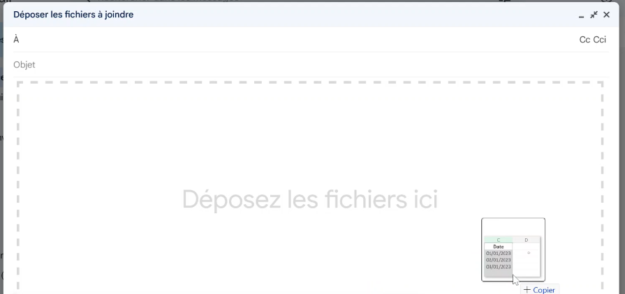
File uploading is probably what most people think about when they hear drag and drop. It’s mostly encountered on desktops rather than mobile because the users have better control over their screens.
File uploading is often represented by a large dropping zone where the term “drag and drop” is written. A lot of people like this direct approach to upload a document, but we always need an alternative for accessibility. That’s why interfaces need a button to open the file explorer.
A common example of this feature is file uploading from a desktop to a website. It’s an important factor to keep in mind because the designer has no control over what is happening outside the website but must still ensure a good user experience. Because it is cross-platform, some files might not be allowed and you need to supply clear error messages and feedback so users aren’t frustrated.
Drag and drop can be used to animate a game. Games use drag and drops in various gameplay, notably on mobile because it’s the most direct interaction to move elements from one place to the other. Some games have made drag and drop the core of their gameplay, like Angry Birds.
Drag and drop is a way to interact with an interface and can be used to change an element, group things together, or upload files. Its biggest advantage is to mimic a real-life gesture for direct results even when things happen in the backend of machines.
How does one design a drag and drop? It can be tricky, but modern tools like Figma simplify the process.
First, I create a draggable component. It is a simple card filled with a picture, text, and a kebab icon to show it can be moved.
Then, I create different states for this component: hover with a shadow to give relief, and drag where the card gets transparency and moves out its place:
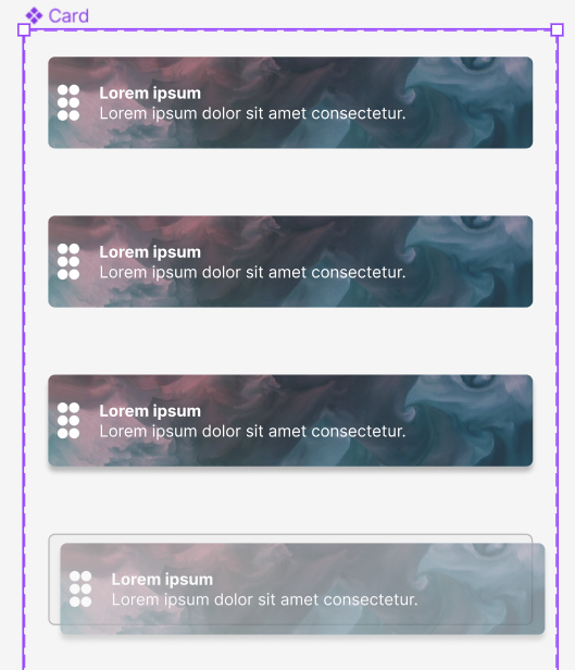
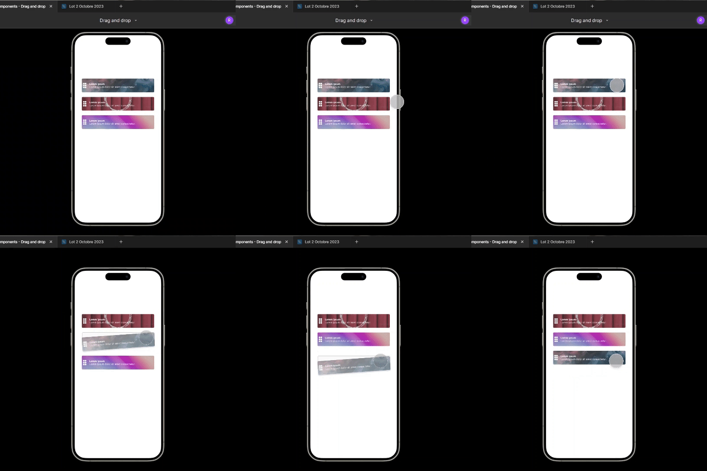
I then create a simple list with my card component. To simulate the drag and drop, I create the final state where the first card has a switch position and an intermediary state representing the dragging moment. The card will go out of its position when clicked on. I have a tilt to accentuate the difference between the moving element and the rest.
By using smart animation when dragging, we get a simulated effect of a list that revamps itself.
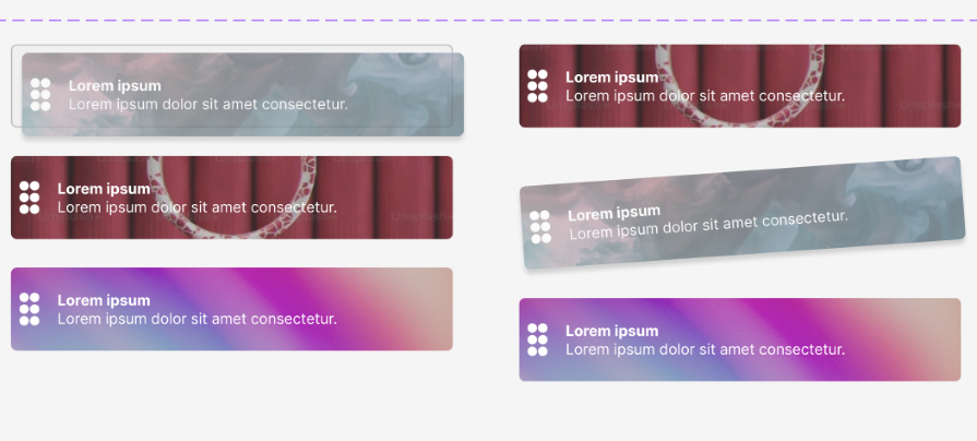
To create a moving list in Figma, we have to use some tricks to simulate interaction. I created a simple list with three cards. Then, I designed every state: grabbing the first card, moving to the second position, and then to the third. To more strongly denote the grab states, I add a small inclination or skew to my card.
With smart animate, I pass from my first list to my second, then I go from one to the other after a delay.
Here are our takeaways from the mockup:
This example is relatively basic; it’s up to the designer to adapt it to the targeted user. If you want access to this example for inspiration, you can download the Figma drag-and-drop file here.
Drag and drop requires intentional design for each of its states. Otherwise, users will feel confused and frustrated like they are when using the Excel example.
As with all components, but especially with drag and drop, it’s important to test with the user and see their reaction. A poorly made drag and drop can render your interface unusable.
LogRocket lets you replay users' product experiences to visualize struggle, see issues affecting adoption, and combine qualitative and quantitative data so you can create amazing digital experiences.
See how design choices, interactions, and issues affect your users — get a demo of LogRocket today.

When familiar patterns start to feel stale, these seven ways will help you revive your design inspiration and to create standout user experiences.
Here’s the lowdown. Scaling icons properly keeps them crisp and clear on any screen size. I talk more on this in the blog.

Brands like Amazon and Walmart have a product page design that sells itself. In this blog, I analyze how they do it and what you can learn from them.

The aesthetic-usability effect shows that users equate beauty with functionality. But where’s the line between looks and usability? The challenge lies in balancing visual appeal with true usability.