In web development projects, developers typically create user interface elements with standard DOM elements. Sometimes, web developers need to create interactive, dynamic, high-performance graphics on web surfaces.

In such scenarios, using traditional HTML or SVG elements won’t offer great performance or all the flexible drawing features you might expect.
We could use the inbuilt HTML canvas API to create interactive, high-performance graphics, but it’s a low-level, less-productive API for modern developers. So, we need to find a high-level canvas library to create interactive graphics with less code.
The solution for this is the Fabric.js HTML canvas library, a fully-featured canvas library that offers a minimal, high-level API to draw interactive, editable shapes, images, and, text on multiple canvas layers. It lets you activate freehand drawing, apply image filters, and use animations.
And Fabric.js’s latest release, v6, has an even better API for modern web development style.
In this article, we’ll check what’s new in Fabric.js v6 and learn how to use it to build interactive canvas graphics by building an image editor app using Fabric.js v6 and React.
The Fabric.js library was initially released in 2010 when the ECMAScript specification didn’t have modern readable asynchronous programming concepts like Promises and async/await keywords, so the earlier Fabric.js versions had old-fashioned callbacks.
Fabric.js v6 modernized its API and development environment by upgrading to modern JavaScript syntax by rewriting the library in TypeScript.
Here is a summary of major breaking changes and enhancements from Fabric.js v6 that you’ll likely need to address in your code:
import { Canvas, Image } from 'fabric’), so developers can write more readable code and JavaScript bundlers can reduce the final source bundle size once the library supports tree-shakingasync/await keywords or Promise methodsdispose() method of the Canvas objectcreateClass() like old utility functions to create custom Fabric classes — you can use the native extends keywordApart from the above major changes and enhancements, other breaking changes include class and method deprecations and parameter changes, as listed in this GitHub issue.
Now you know the benefits of using Fabric.js for creating interactive canvas elements and new features and changes in v6. Let’s learn how to work with Fabric.js v6 by building a simple image editor app. The image editor app will cover all major Fabric.js features by implementing image importing, image filtering, text element creation, and freehand drawing features.
We’ll use React to develop the image editor, so create a new app with Create React App (CRA) as follows:
npx create-react-app fabric-image-editor
cd fabric-image-editor
Let’s create the structure of the image editor before installing the required dependencies. Divide the screen into two rows for the toolbox and canvas with CSS Flexbox by adding the following code to the components/App.js file:
import Toolbox from './Toolbox';
import EditorCanvas from './EditorCanvas';
import './App.css';

function App() {
  return (
    <div className="editor">
      <Toolbox />
      <EditorCanvas />
    </div>
  );
}

export default App;
The application structure uses two sub-components: Toolbox and EditorCanvas to reduce the complexity of growing code lines. Create the Toolbox component with several placeholder buttons by adding the following code to the components/Toolbox.js file:
const Toolbox = () => {
  return (
    <div className="toolbox">
      <button />
      <button />
      <button />
    </div>
  );
};

export default Toolbox;
Next, create the final sub-component, EditorCanvas, which will hold the HTML canvas element of our image editor app:
const EditorCanvas = () => {
  return (
    <div className="canvasbox">
      <canvas width="1000" height="500"></canvas>
    </div>
  );
};

export default EditorCanvas;
Now we need to style this app structure using CSS by adding the following CSS definitions to the components/App.css file:
.editor {
  display: flex;
  flex-flow: column;
  height: 100vh;
}

.toolbox {
  padding: 0.5em;
  background-color: #414141;
  display: flex;
  gap: 0.5em;
}

.toolbox button {
  width: 32px;
  height: 32px;
  position: relative;
  font-size: 16px;
  border: none;
  background-color: #ccc;
  border-radius: 0.2em;
}

.canvasbox {
  overflow: auto;
  flex: 1;
  background-color: #777;
}

.canvasbox canvas {
  width: 1000px;
  height: 500px;
  background-color: white; /* TODO: remove */
}
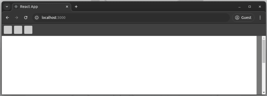
Start the React app with npm start or yarn start. You’ll see the structure of the image editor app with several placeholder buttons:
Now we can start adding required dependencies to continue with the development process. We’ll use Fabric.js as the canvas library and Font Awesome SVG icons package, so install them using the following commands:
npm install fabric @fortawesome/fontawesome-svg-core @fortawesome/free-solid-svg-icons @fortawesome/react-fontawesome
#--- or ---
yarn add fabric @fortawesome/fontawesome-svg-core @fortawesome/free-solid-svg-icons @fortawesome/react-fontawesome
The current canvas is an empty, native HTML canvas element that has a white background added with CSS — nothing happens when you click or drag using your mouse or touchpad. We need to turn this empty canvas into a Fabric.js editing canvas to start building the image editor app.
Import Fabric.js Canvas class and other required React functions in the App.js file:
import { useRef, useEffect, useState } from 'react';
import { Canvas } from 'fabric';
Next, initialize a Fabric.js canvas instance and bind it to the <canvas> element within the App function:
const canvasRef = useRef(null);
const [canvas, setCanvas] = useState(null);

useEffect(() => {
  const canvas = new Canvas(canvasRef.current, { backgroundColor: 'white' });
  canvas.setDimensions({ width: 1000, height: 500 });
  setCanvas(canvas);

  return () => canvas.dispose();

}, [canvasRef, setCanvas]);
Here we use a React reference to get the canvas DOM reference and the canvas state to store the Fabric.js instance reference.
Update the component template by passing the canvas element reference and the Fabric.js instance via component props:
return (
  <div className="editor">
    <Toolbox
      canvas={canvas}
    />
    <EditorCanvas
      ref={canvasRef}
      canvas={canvas}
    />
  </div>
);
Here we passed the canvas reference to the EditorCanvas via ref, so we need to wrap the EditorCanvas component with forwardRef, as shown in the following code snippet:
import { forwardRef } from 'react';

const EditorCanvas = forwardRef(({}, ref) => {
  return (
    <div className="canvasbox">
      <canvas ref={ref} width="1000" height="500"></canvas>
    </div>
  );
});

export default EditorCanvas;
Finally, remove the temporary background-color property from the canvas element:
.canvasbox canvas {
  width: 1000px;
  height: 500px;
  /* background-color: white; TODO: remove */
}
The above changes are enough to initialize Fabric.js with a native canvas element. Try dragging the mouse on the canvas area. You’ll see a selection box indicating that Fabric.js is initialized:

Now, our Fabric.js canvas is ready to hold images, shapes, texts, and all supported Fabric.js objects. Let’s add a new toolbox button to let app users import new images into the photo editing area.
We’ll use Font Awesome icons in toolbox buttons, so import all the icons we’ll use from the index.js source file:
import { library } from '@fortawesome/fontawesome-svg-core';
import {
  faImage,
  faFont,
  faPencil,
  faFilter,
  faTrash,
  faDownload
} from '@fortawesome/free-solid-svg-icons';

library.add(faImage, faFont, faPencil, faFilter, faTrash, faDownload);
Import the Font Awesome icon component and Fabric.js Image class from the Toolbox.js file as follows:
import { Image } from 'fabric';
import { FontAwesomeIcon } from '@fortawesome/react-fontawesome';
Add a new button to import an image, and add the selected image to the canvas by updating the Toolbox component implementation, as shown in the following code snippet:
const Toolbox = ({ canvas }) => {
  function fileHandler(e) {
    const file = e.target.files[0];
    const reader = new FileReader();

    reader.onload = async (e) => {
      const image = await Image.fromURL(e.target.result);
      image.scale(0.5);
      canvas.add(image);
      canvas.centerObject(image);
      canvas.setActiveObject(image);
    };
    reader.readAsDataURL(file);
    e.target.value = '';
  }

  return (
    <div className="toolbox">
      <button title="Add image">
        <FontAwesomeIcon icon="image" />
        <input
          type="file"
          accept=".png, .jpg, .jpeg"
          onChange={fileHandler} />
      </button>
    </div>
  );
};
Here we use the native HTML file picker element with the inbuilt FileReader interface to read the selected image as a base64-encoded data URL. The encoded image URL is used to create a new Fabric.js image by using the Image.fromURL() asynchronous method.
Use the following CSS definition to hide the native file picker element by letting users open the file picker by clicking on the toolbox button:
.toolbox input[type=file] {
  opacity: 0;
  position: absolute;
  inset: 0;
}
Open the app, click the add image button, and select any image. You can move, resize, and rotate imported images using the default Fabric.js controls, as shown in the following preview:
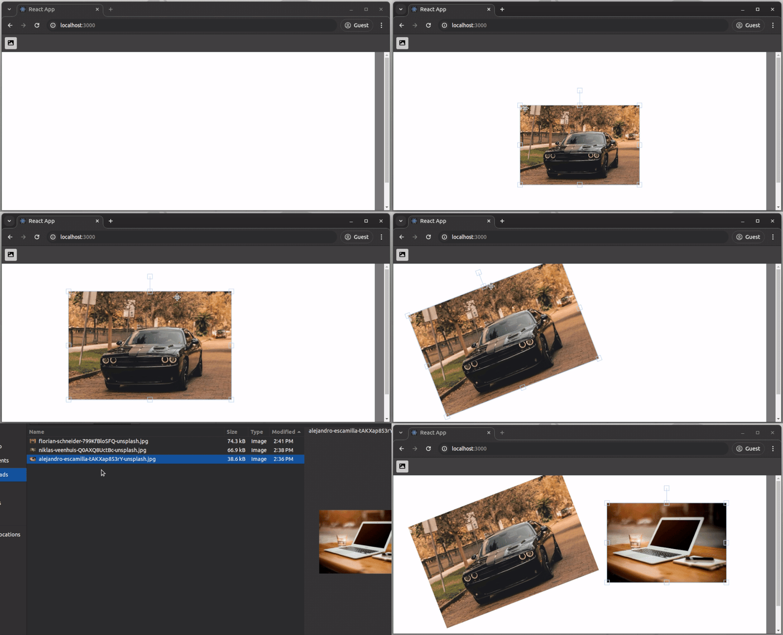
Try to import different images and manipulate those image objects using inbuilt Fabric.js object controls. You can undoubtedly import PNG images that have alpha channels (transparent regions).
Fabric.js supports adding editable and non-editable text objects into the canvas. Let’s add a new toolbox button to add a new editable text element to the image editor surface.
First, add a new toolbox button with a click handler:
<button title="Add text" onClick={addText}>
  <FontAwesomeIcon icon="font" />
</button>
Next, implement the click handler by writing code to add a new interactive text element into the Fabric.js canvas as follows:
function addText() {
  const text = new IText('Edit this text');
  canvas.add(text);
  canvas.centerObject(text);
  canvas.setActiveObject(text);
}
Here we used the IText class to create a new editable text element, so make sure to import it from the fabric package:
import { Image, IText } from 'fabric';
Now you can add new text elements by clicking the newly added toolbox button. You can double-click on the text element to change text and use controls to move, resize, or rotate as usual:

Fabric.js has a pre-developed freehand drawing implementation that supports several inbuilt brush types. Let’s activate simple freehand drawing support in the image editor app by using the PencilBrush class. We’ll add a toggle button to activate/deactivate drawing mode, so create a new state field for the drawing mode in the Toolbox component:
const [drawingMode, setDrawingMode] = useState(false);
Add the following function to the Toolbox component to toggle the drawing mode:
function toggleDrawingMode() {
  canvas.isDrawingMode = !canvas.isDrawingMode;
  setDrawingMode(canvas.isDrawingMode);
}
Next, add a new button to toggle the drawing mode:
<button title="Drawing mode" onClick={toggleDrawingMode} className={drawingMode ? 'active' : ''}>
  <FontAwesomeIcon icon="pencil" />
</button>


.toolbox button.active {
  background-color: #edbd50;
}
These code changes activate the drawing mode, but you won’t see any drawing lines when you draw things on the canvas since we need to set the default freehand drawing brush first. Set the default brush by adding the following statements into the useEffect() block of the App component:
const brush = new PencilBrush(canvas);
brush.color = 'black';
brush.width = 5;
canvas.freeDrawingBrush = brush;
Click on the freehand drawing mode button and draw something. You can go back to the selection mode by clicking on the same toolbox button, as shown in the following preview:

Try to use a different brush type as the default freehand drawing brush, i.e., CircleBrush.
Fabric.js implements many inbuilt filter algorithms that you can add to image objects, so we can use several filters in this sample image editor app too. We’ll add a new toggle button into the toolbox that users can click to activate a preferred image filter.
First, add a new button and a filter list to the toolbox:
<button title="Filters"
  onClick={() => setCurrentFilter(currentFilter ? null : 'sepia')}
  className={currentFilter ? 'active' : ''}>
  <FontAwesomeIcon icon="filter" />
</button>
{currentFilter &&
  <select onChange={(e) => setCurrentFilter(e.target.value)} value={currentFilter}>
    <option value="sepia">Sepia</option>
    <option value="vintage">Vintage</option>
    <option value="invert">Invert</option>
    <option value="polaroid">Polaroid</option>
    <option value="grayscale">Grayscale</option>
  </select>
}


.toolbox select {
  border-radius: 0.2em;
  min-width: 10em;
}
Here we used the currentFilter state field to store the current filter name of the selected image. Get the filter name and setter from props since we create the filter state in App:
const Toolbox = ({ canvas, currentFilter, setCurrentFilter }) => {
// ...
Apply the selected filter when the currentFilter gets changed in a new component rendering event, as shown in the following code snippet using a useEffect() block:
import { Image, IText, filters } from 'fabric';
// ...

useEffect(() => {
  if(!canvas ||
    !canvas.getActiveObject() ||
    !canvas.getActiveObject().isType('image')) return;

  function getSelectedFilter() {
    switch(currentFilter) {
      case 'sepia':
        return new filters.Sepia();
      case 'vintage':
        return new filters.Vintage();
      case 'invert':
        return new filters.Invert();
      case 'polaroid':
        return new filters.Polaroid();
      case 'grayscale':
        return new filters.Grayscale();
      default:
        return null;
    }
  }
  const filter = getSelectedFilter();
  const img = canvas.getActiveObject();

  img.filters=filter ? [filter] : [];
  img.applyFilters();
  canvas.renderAll();
}, [currentFilter, canvas]);
The above useEffect() block detects filter changes and applies the selected filter to the currently selected image object. Here we used only five filters, but you can use more filters by checking all supported filter implementations in the filters object.
Create a new state field in the App component to store the current filter and make sure to pass it into child components:
const [currentFilter, setCurrentFilter] = useState(null);
// ...
return (
  <div className="editor">
    <Toolbox
      canvas={canvas}
      currentFilter={currentFilter}
      setCurrentFilter={setCurrentFilter}
    />
    <EditorCanvas
      ref={canvasRef}
      canvas={canvas}
      setCurrentFilter={setCurrentFilter}
    />
  </div>
);
Here we passed parent state fields into child components via props since we have only one child component level, but you should use React context API if your app has child elements within child elements to avoid prop drilling.
Now you can activate filters for a selected image object, as demonstrated in the following preview:

As you noticed it doesn’t properly change the filter activation status and detect filters of the selected image object, so we have to subscribe to Fabric.js events to change the filter selection list based on the currently selected image’s filter.
First, get the filter name setter from the props of the EditorCanvas component as follows:
const EditorCanvas = forwardRef(({ canvas, setCurrentFilter }, ref) => {
// ...
Next, add the following useEffect() block to set the current filter name according to the filter of the currently selected image object by listening to Fabric.js selection events:
useEffect(() => {
  if(!canvas) return;

  function handleSelection(e) {
    const obj = e.selected?.length === 1 ? e.selected[0] : null;
    const filter = obj?.filters?.at(0);
    setCurrentFilter(filter ? filter.type.toLowerCase() : null);
  }

  canvas.on({
    'selection:created': handleSelection,
    'selection:updated': handleSelection,
    'selection:cleared': handleSelection
  });

  return () => {
    canvas.off({
      'selection:created': handleSelection,
      'selection:updated': handleSelection,
      'selection:cleared': handleSelection
    });
  }

}, [canvas, setCurrentFilter]);
Now, the image editor changes the applied filter name properly when users work with multiple images:

Fabric.js offers many inbuilt image editing features, but it doesn’t implement keyboard support out of the box. However, we can easily listen to global keystrokes with the browser event listener API and trigger Fabric.js features to implement better, flexible keyboard support.
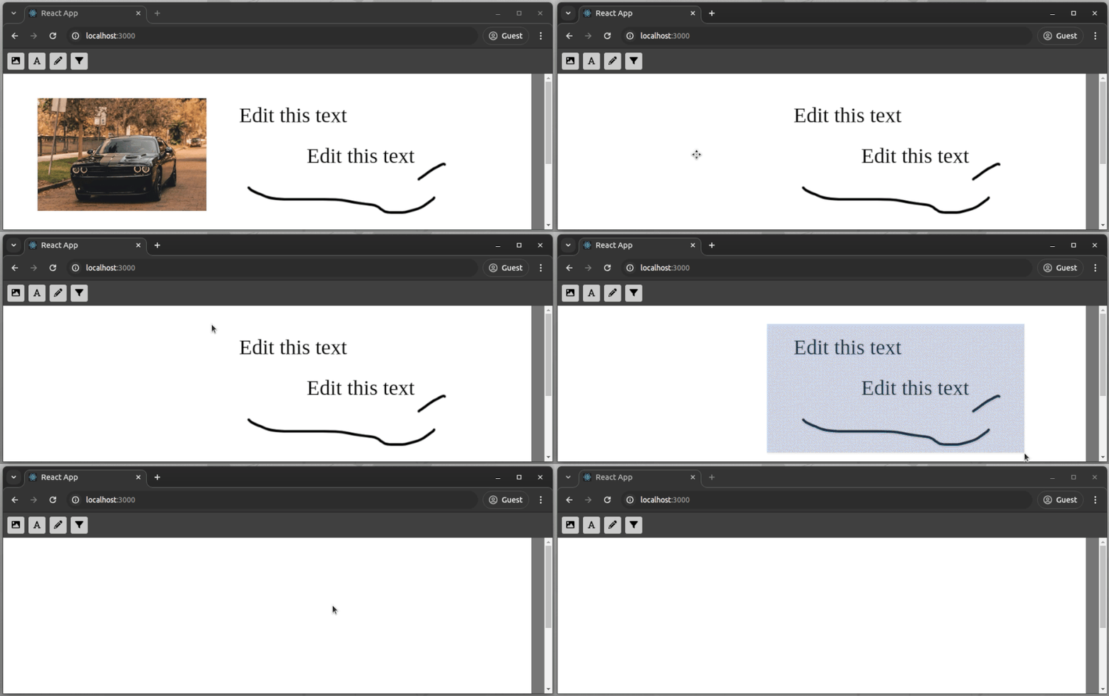
To learn keyboard handling, we can let users remove selected canvas objects by pressing the delete key.
Listen to key-down events and remove selected elements by adding the following code statements into the useEffect() block of the EditorCanvas component:
function handleKeyDown(e) {
  if(e.key === 'Delete') {
    for(const obj of canvas.getActiveObjects()) {
      canvas.remove(obj);
      canvas.discardActiveObject();
    }
  }
}

document.addEventListener('keydown', handleKeyDown, false);
Make sure to remove the attached event listener when the component gets unmounted:
useEffect(() => {
// ...
  return () => {
    document.removeEventListener('keydown', handleKeyDown, false);
// ...
Try removing objects from the canvas by selecting single or multiple elements and pressing the delete key from the keyboard:
You can easily start implementing the cut-copy-paste feature and moving objects with arrow keys using the same key-down handler we’ve created before.
What if the user needs to clear all existing objects and start with a new design? Asking the user to select all elements and press the delete key is not user-friendly, so let’s add a new toolbox button to let users clear the canvas instantly.
Add a new toolbox button with a click handler as follows:
<button title="Clear all" onClick={clearAll}>
  <FontAwesomeIcon icon="trash" />
</button>


function clearAll() {
  if(window.confirm('Are you sure you want to clear all?')) {
    canvas.remove(...canvas.getObjects());
  }
}
The above toolbox button removes all existing canvas objects after showing a user confirmation dialog, as demonstrated in the following preview:

Every image editor program lets users export the current design as an image. Most browsers nowadays support using PNG image format exports in the toDataURL() method of the native canvas element, so we can use it to export Fabric.js canvas as an image:
<button title="Download as image" onClick={downloadImage}>
  <FontAwesomeIcon icon="download" />
</button>


function downloadImage() {
  const link = document.createElement('a');
  link.download = 'photo_editor_image.png';
  link.href = canvas.toDataURL();
  link.click();
}
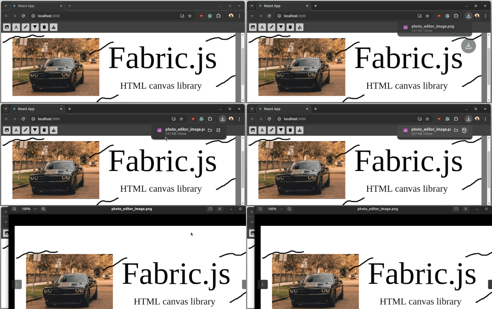
The web browser will download a PNG image that contains a snapshot of the Fabric.js canvas when you click on the download button, as demonstrated in the following preview:
You can access the complete source code of this sample image editor app from this GitHub repository.
We’ve covered a lot by creating this image editor app via Fabric.js’s key features. That said, there are other ideas you could implement to convert this sample image editor into a fully-featured, advanced image editor program like Adobe Photoshop:
Circle, Rect, etc.If there’s a really good tip not listed here that you think other would benefit from, leave it in the comments!
In this tutorial, we learned how to use Fabric.js v6 with React by developing a sample image editor app that supports importing images, adding text elements, and activating image filters. We also learned how to use inbuilt standard browser APIs with Fabric.js to add keyboard support and export canvas as a PNG image.
In v6, Fabric.js improved its API by migrating into TypeScript and using a Promise-based, modular codebase, so using Fabric.js v6 doesn’t bring the callbacks-based old-fashioned coding style that v5 and older versions had.
The official documentation is not updated yet for the latest modular, Promise-based coding style and the library maintainers are working on documentation updates.
Whether you’re motivated to create an Adobe Photoshop-like image editor or Figma-esque UI design software, the above demonstration should set you on the straight and narrow towards an excellent project. Happy coding.
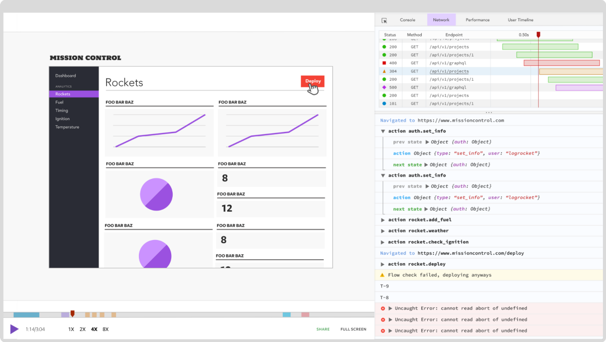
LogRocket is a frontend application monitoring solution that lets you replay problems as if they happened in your own browser. Instead of guessing why errors happen or asking users for screenshots and log dumps, LogRocket lets you replay the session to quickly understand what went wrong. It works perfectly with any app, regardless of framework, and has plugins to log additional context from Redux, Vuex, and @ngrx/store.
In addition to logging Redux actions and state, LogRocket records console logs, JavaScript errors, stacktraces, network requests/responses with headers + bodies, browser metadata, and custom logs. It also instruments the DOM to record the HTML and CSS on the page, recreating pixel-perfect videos of even the most complex single-page and mobile apps.
Debugging code is always a tedious task. But the more you understand your errors, the easier it is to fix them.
LogRocket allows you to understand these errors in new and unique ways. Our frontend monitoring solution tracks user engagement with your JavaScript frontends to give you the ability to see exactly what the user did that led to an error.
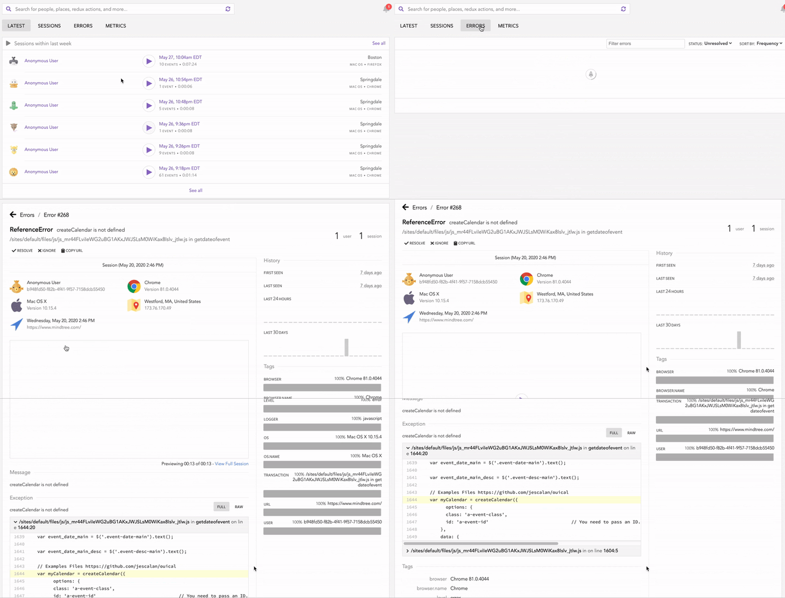
LogRocket records console logs, page load times, stack traces, slow network requests/responses with headers + bodies, browser metadata, and custom logs. Understanding the impact of your JavaScript code will never be easier!
Install LogRocket via npm or script tag. LogRocket.init() must be called client-side, not
server-side
$ npm i --save logrocket

// Code:

import LogRocket from 'logrocket';
LogRocket.init('app/id');
// Add to your HTML:

<script src="https://cdn.lr-ingest.com/LogRocket.min.js"></script>
<script>window.LogRocket && window.LogRocket.init('app/id');</script>
Would you be interested in joining LogRocket's developer community?
Join LogRocket’s Content Advisory Board. You’ll help inform the type of content we create and get access to exclusive meetups, social accreditation, and swag.
Sign up now
Simplify component interaction and dynamic theming in Vue 3 with defineExpose and for better control and flexibility.

Explore how to integrate TypeScript into a Node.js and Express application, leveraging ts-node, nodemon, and TypeScript path aliases.

es-toolkit is a lightweight, efficient JavaScript utility library, ideal as a modern Lodash alternative for smaller bundles.

The use cases for the ResizeObserver API may not be immediately obvious, so let’s take a look at a few practical examples.