Sunday, January 22, 2023

Book review: Riddley Walker


This is a rather unique book. It tells the odyssey of the eponymous Riddley Waler who lives in a far future dystopia after a nuclear war reduced human civilization back to the iron age. Essentially, a series of events happen that lead to the protagonist being forced to leave his community where he interacts with the larger post-apocalyptic society he finds himself in and its various political, mythological and philosophical elements, stumbles upon the re-invention of gun powder, and in the end becomes a traveling story teller.

Plenty of books have been written with the premise of nuclear war destroying civilization. What makes this book unique is the writing style. To signify that significant time has passed, all the spelling in the book is non-standard. For example, here is a quote:

The worl is ful of things waiting to happen. Thats the meat and boan of it right there. You myt think you can jus go here and there doing nothing. Happening nothing. You cant tho you bleeding cant. You put your self on any road and some thing wil show its self to you. Wanting to happen. Waiting to happen. You myt say, 'I dont want to know.' But 1ce its showt its self to you you wil know wont you. You cant not know no mor. There it is and working in you. You myt try to put a farness be twean you and it only you cant becaws youre carrying it inside you. The waiting to happen aint out there where it ben no more its inside you.

As you can imagine, this is pretty frustrating to read a times. Sometimes I think something means something, and discover chapters later that I misinterpreted it. I suspect if I read it a second time I would get a lot more out of it, but I also don't know I want to. At the same time I'm glad I read it at least once. It does feel quite different from any other books I've read.

One of things I like most about this book is the world truly feels alien. Too often science fiction books have aliens with superficial differences that feel basically the same as any modern day western culture. Although these are of course not aliens, I really did feel that this book depicted a society very different from our contemporary society. It wasn't just America with one quirk changed.

A large part of the book deals with the myth around "Eusa". I originally thought that this was talking about the United States and nuclear war, but it appears it is actually about St. Eustace. Or perhaps the intention is to be both? It is certainly interesting when reading this book how you can think one thing and then end up re-evaluating it all later.

The most closest comparison to another book is probably certain scenes in Cloud Atlas, although it seems that David Mitchell was taking very direct inspiration from this novel. However if you ignore the unique language, I think The Shadow of the Torturer is kind of similar. Which is interesting, as I didn't really like that book, but I got the same sort of feel from it. I suppose its the journey through a different world vibe that is similar.

In conclusion, certainly an interesting book but also a very frustrating book. I liked it but I don't think I would ever want to read it again.

Friday, January 20, 2023

The Vector-pocalypse is upon us!


tl;dr: [[WP:IDONTLIKEIT]]

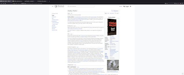
Yesterday, a new version of the Vector skin was made default on English Wikipedia.

As will shock absolutely no one who pays attention to Wikipedia politics, the new skin is controversial. Personally I'm a Timeless fan and generally have not liked what I have seen of new vector when it was in development. However, now that it is live I thought I'd give it another chance and share my thoughts on the new skin. For reference I am doing this on my desktop computer which has a large wide-screen monitor. It looks very different on a phone (I actually like it a lot better on the phone). It might even look different on different monitors with different gamuts.


So the first thing that jumps out is there is excessive whitespace on either side of the page. There is also a lot more hidden by default, notably the "sidebar" which is a prominent feature on most skins. One minor thing that jumps out to me is that echo notifications look a little wonky when you have more than 100 of them.

On the positive though, the top bar does look very clean. The table of contents is on the left hand side and sticky (Somewhat similar to WikiWand), which I think is a nice change.

When you scroll, you notice the top bar scrolls with it but changes:

On one hand, this is quite cool. However on reflection I'm not sure if I feel this is quite worth it. It feels like this sticky header is 95% of the way to working but just not quite there. The alignment with the white padding on the right (I don't mean the off-white margin area but the area that comes before that) seems slightly not meeting somehow. Perhaps i am explaining it poorly, but it feels like there should be a division there since the article ends around the pencil icon. Additionally, the sudden change makes it feel like you are in a different context, but it is all the same tools with different icons. On the whole, I think there is a good idea here with the sticky header, but maybe could use a few more iterations.

If you expand the Sidebar menu, the result feels very ugly and out of place to me:


idk, I really hate the look of it, and the four levels of different off-whites. More to the point, one of the key features of Wikipedia is it is edited by users. To get new users you have to hook people into editing. I worry hiding things like "learn to edit" will just make it so people never learn that they can edit. I understand there is a counter-point here, where overwhelming users with links makes users ignore all of them and prevents focus on the important things. I even agree somewhat that there are probably too many links in Monobook/traditional vector. However having all the links hidden doesn't seem right either.


On the fixed width

One of the common complaints is that the fixed width design wastes lots of screen real estate. The counter argument is studies suggest that shorter line lengths improve readability.

As a compromise there is a button in the bottom right corner to make it use the full screen. It is very tiny. I couldn't find it even knowing that it is supposed to be somewhere. Someone had to tell me that it is in the lower-right corner. So it definitely lacks discoverability.

Initially, I thought I hated the fixed-width design too. However after trying it out, I realized that it is not the fixed width that I hate. What I really hate is:

  • The use of an off-white background colour that is extremely close to the main background colour
  • Centering the design in the screen

 I really really don't like the colour scheme chosen. Having it be almost but not quite the same colour white really bothers my eyes.

I experimented with using a darker colour for more contrast and found that I like the skin much much better. Tastes vary of course, so perhaps it is just me. Picking a dark blue colour at random and moving the main content to the left looks something like:


 Although I like the contrast of the dark background, my main issue is that in the original the colours are almost identical, so even just making it a slightly more off-white off-white would be fine. If you want to do a throwback to monobook, something like this looks fine to me as well:


I don't really know if this is just my particular tastes or if other people agree with me. However, making it more left aligned and increasing the contrast to the background makes the skin go from something I can't stand to something I can see as usable.